Your logo design might not single-handedly determine your brand’s success, but it plays a major role in shaping how people perceive your business. A professional, well-crafted logo can instantly make your company look established, trustworthy, and credible—while also communicating the quality of your products and services.
In today’s competitive market, your logo serves as the face of your brand. Whether it’s displayed on your website, product packaging, social media, or advertising materials, it should leave a lasting impression.
Here are seven expert logo design tips to help you create a professional, versatile, and memorable logo for your business.


Tip 1 – Avoid generic symbols

Using overused or generic logo icons is one of the most common mistakes in branding. Symbols like lightbulbs for “ideas” or globe icons for “global reach” are used so frequently that they fail to stand out.
Pro Tip: Research logo clichés in your industry and avoid them. Instead, create a custom icon or symbol that reflects your brand’s unique story, values, and vision.
Tip 2 – Be Different

If your logo looks too similar to your competitors, customers might mistake your business for a copycat. This not only affects brand recall but can also hurt your credibility.
Pro Tip: Study your competitors’ branding and design something distinct. A unique logo will make your business more recognizable and memorable in the market.
Tip 3 – Single Color First

A truly strong logo should look great in black and white before you even add color. This ensures it’s adaptable for any medium—whether it’s a website header, business card, or promotional merchandise.
Pro Tip: Once your single-color logo looks balanced and readable, you can add brand colors for more personality.
Tip 4 – Thumbnail Friendly
With so much brand interaction happening on mobile devices and social media, your logo should remain clear and legible at small sizes.
Pro Tip: Test your logo on different screen sizes and platforms—like a social media profile picture or mobile app icon—to ensure it maintains its impact.
Tip 5 – Right Color Combo
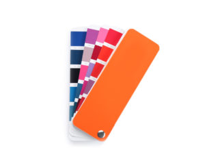
Colors create emotional connections and influence how your brand is perceived. Use colors that align with your brand personality and appeal to your target audience.
Pro Tip: Use design tools like Paletton or Canva’s Color Wheel to find complementary colors. Stick to 2–3 main colors for a cleaner, more cohesive look.
Tip 6 – Have a focal point

A cluttered design with too many competing elements can confuse viewers. Your logo should have one primary focal point that draws attention first.
Pro Tip: In most cases, this focal point is your main graphic or icon, with clean typography to support it.
7. Keep Elements Clear and Balanced

Good logo design is about simplicity and clarity. Give your elements enough white space and make sure there’s proper contrast with the background.
Pro Tip: Choose fonts and shapes that are easy to read, recognize, and remember—even from a quick glance.
Final Thoughts
Your logo is a key part of your brand identity—it’s more than just a pretty design. When done right, it communicates your values, attracts the right audience, and strengthens brand recognition.
Need a professional logo design that connects your brand with your audience?
Our team specializes in creating goal-driven, high-quality branding and marketing designs that help businesses stand out.
Let’s collaborate and bring your brand vision to life! Contact us.

