Digital marketing is an essential tool for business owners and marketing teams to grow their companies. This still applies even if they are only targeting their immediate locality. This can be done through multiple channels like social media, your website, email, and paid ads. If you’re already implementing these, so do your competitors and even other companies. With these tons of ads in front of their screens, how do you stand out? How can you grab their attention even with just a glance?
This is where creating digital marketing designs with visual hierarchy comes in.
What is Visual Hierarchy?
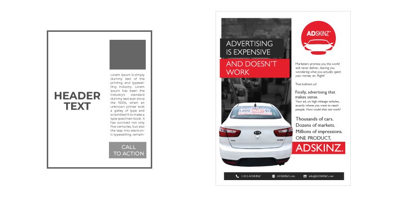
This is how you arrange and show your elements and content in an order. This allows you to influence what they read or see first up to the last part of your content. Think of it like a funnel where you are leading them towards a goal. This way, it is easier for the viewer to understand and grasp the message of your marketing material. Check out the difference between the two materials below with the same content but laid out differently.
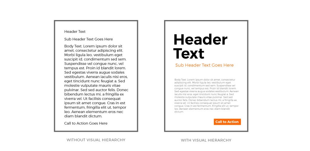
Which of the two do you think looks more professional? and which do you think is more engaging? This is just a sample of how digital marketing design with visual hierarchy can help improve your efforts. Without a strong visual hierarchy implemented, our eyes will follow a predictable pattern that is left to right and top to bottom. The pattern can be shaped like a Z or F.
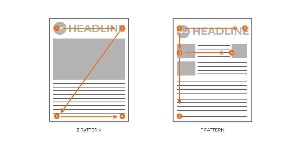
Digital marketing content and hierarchy
On top of your hierarchy should be the main image or header text which will be used to catch the attention of the viewer.
Once you have their attention, we will then lead them to the details supporting the header and main image. This will be the second level of our hierarchy. This should give them a reason to keep on reading to the next section. You can do this by talking about their problem, how this affects their lives and that there is a solution.
If they have reached this far, we will then present to them the solutions to their problems. This is done through your offers, products, and services. This will be our third level and will now lead to our last and final step which is the “call to action” section. This is where you instruct your reader on what to do. Thee ultimate goal of your digital marketing material.

How do you implement a visual hierarchy with the content?
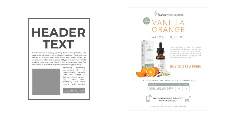
There are several ways we can make sure the readers will go over your marketing material content from the top of your hierarchy up to the bottom just as we laid it out in the hierarchy content above. Check out these digital marketing designs with visual hierarchy samples and principles you can use for your layout:
1. Size difference
The size difference for each section in your design will help guide your viewer’s eye on what they will be looking at first. The top of the hierarchy will have the biggest size, and the rest of the sections will be sized according to their position.
2. Colors
The brighter the color the more attention it gets and the opposite with muted colors. You can use a bright color for your header and muted colors for your body. The more color difference an object has with its background, the more it stands out. For example, if we use a black colored background, the header can be in a white or yellow color so it stands and the details can be in light gray.

3. Spacing
The more space an element has around it, the more attention it gets. This is the reason why white spaces are just as useful as your content. Have your header or main image stand on its own in a particular area with a lot of white space on your design and place the other elements together on another corner. Placing your elements near each other will give the impression that they are related or connected.

4. Alignment
When all your elements are aligned, the one on top will be seen or read first, and the ones below it will follow. If you take an element and separate it from the rest of the alignment then this will attract the most attention and our eyes will look at it first. You can use this for the header or main image.
5. Contrast
The difference in size, color, texture, and font can create a visual hierarchy in your layout. The more different the section is from the rest of the elements, the more it stands out, and the higher in the hierarchy it will be.
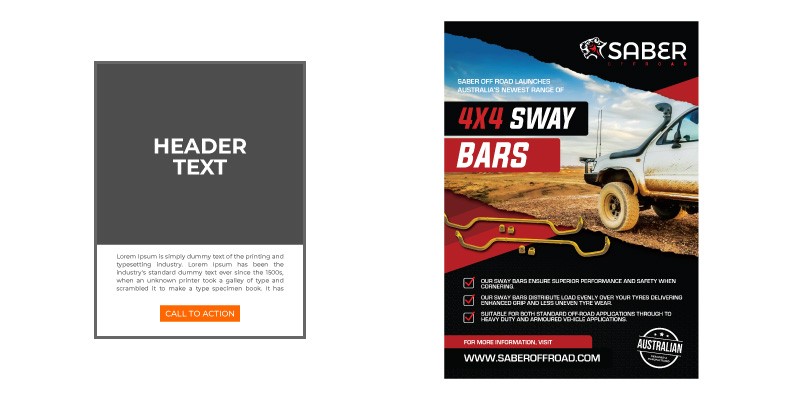
You can use and mix any of these principles as you see fit. You are not limited to just using one when creating your digital marketing material designs. Just be sure to apply a visual hierarchy in your layout to ensure that you will have the best chance to catch your intended audience’s attention. It’s easier to read, looks more interesting, and makes the content easier to understand.
If you need help with your digital marketing designs, just send us a message and we’d be happy to help.

