In graphic design, contrast is the difference between two or more elements — and it’s one of the fundamental principles of design. Mastering contrast is essential when creating effective branding and marketing materials because it influences readability, focus, and overall visual appeal.
While most people associate contrast with making text easier to read, its applications go far beyond that. When used strategically, contrast can help you grab attention, guide your audience’s eyes, and make your designs stand out in a crowded feed or advertising space.
1. Adding Focus to Key Elements
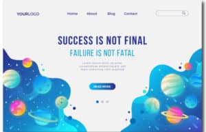
If you want your audience to notice a particular section or object first, use contrast to create emphasis. You can achieve this by:
- Choosing a bold color that stands out from the background
- Using different textures or patterns
- Adjusting size, layout, or orientation
- Surrounding the element with negative space to make it stand out
This technique is especially powerful in ad campaigns, product highlights, and promotional graphics.
2. Making Comparisons Clear
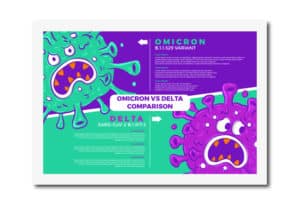
Contrast is a designer’s best friend when it comes to comparison-based content. Whether you’re showcasing product features, pricing tiers, or “before and after” results, using contrasting section backgrounds makes the differences immediately visible.
This approach is especially effective in:
- Comparison infographics
- Service package breakdowns
- Side-by-side visual analyses
3. Creating Clear Sections for Better Readability

Large blocks of text or cluttered designs can overwhelm viewers. By dividing your content into smaller, clearly separated sections using contrast, you make your designs easier to digest.
For example:
- Use alternating background colors
- Switch between light and dark tones
- Adjust layouts for visual separation
This works well in brochures, landing pages, and social media carousels.
4. Building a Visual Hierarchy
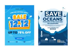
A visual hierarchy guides the viewer’s eyes in the order you want them to see things. With contrast, you can:
- Make headlines larger and bolder
- Use darker colors for primary text
- Apply lighter shades for supporting information
This ensures your most important message gets noticed first, a must for ads, posters, and website headers.
5. Breaking Monotony
A flat, uniform design can quickly bore your audience. By incorporating contrasting elements, you can add energy, rhythm, and interest to your visuals.
This keeps people engaged and encourages them to spend more time looking at your content — a key factor in social media marketing and brand storytelling.
Why Contrast is Essential for Branding and Marketing
Whether you’re designing social media posts, advertisements, or corporate materials, contrast is one of the easiest ways to make your visuals:
- Stand out
- Communicate clearly
- Capture attention in seconds
By mastering this principle, you can transform ordinary designs into impactful, high-converting marketing assets.
Pro Tip: Always check your contrast ratio, especially for text, to ensure accessibility for all viewers. Tools like the WCAG Contrast Checker can help keep your designs inclusive.
Want more design tips for your brand?
Explore our branding and marketing design blog for strategies that make your visuals unforgettable.

