Designing for print is different from designing for digital. While both require creativity and attention to detail, print design has its own set of technical requirements and considerations. If you overlook these, you risk ending up with materials that look unprofessional — or worse, need to be reprinted at extra cost.
Before sending your project to the printer, make sure you’re not making these common print design mistakes.
1. Using the Wrong Software

Yes, you can create a brochure in Microsoft Word or similar programs, but these tools have limited design capabilities and are not built for professional print production.
Best Tools for Print Design:
- Adobe Photoshop — for designs with photo manipulation.
- Adobe Illustrator — for logos, vector graphics, and scalable designs.
- Adobe InDesign — for multi-page layouts like magazines, catalogs, and booklets.
Pro Tip: Always choose software that supports high-resolution outputs and professional print formats.
2. Incorrect File Settings

Using the wrong file settings is one of the biggest reasons designs print poorly.
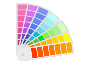
- Small prints (flyers, brochures, posters): Set color mode to CMYK and resolution to 300 dpi.
- Large-scale prints (banners, billboards): Set color mode to CMYK and resolution to 120 dpi to balance quality and file size.
3. Low-Resolution Images or Missing Vector Graphics

Even the most creative layout will fail if your images are blurry or pixelated.
- Use high-resolution photos (300 dpi for small prints) and vector graphics for logos and illustrations so they scale without losing quality.
4. Ignoring the Material

The material you’re printing on can dramatically affect the final look of your design.
- Consider the background color: If printing on red paper, use colors that contrast well with red.
- Think about texture: Textured materials may require simpler, bolder designs for better readability.
5. Skipping Bleeds and Safe Zones

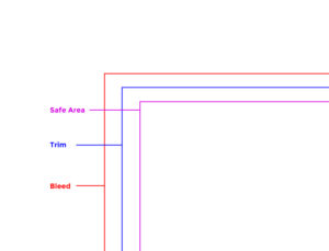
Professional printers require bleeds and safe zones to ensure a clean final cut.
- Bleed: Extend your background or design at least ⅛ inch (3 mm) beyond the trim line to prevent unwanted white edges.
- Safe Zone: Keep all important text and images at least ⅛ inch (3 mm) inside the trim area to avoid accidental cutting.
6. Forgetting to Proofread and Test Print

Spelling errors, wrong contact details, and color mismatches can ruin your entire print run.
- Always proofread your content and request a test print before mass production to catch mistakes early.
Final Takeaway
By avoiding these common print design mistakes, you’ll save time, money, and stress — while ensuring your marketing materials look professional and on-brand.
Want more tips for professional print design?
Getting to know these mistakes is one of the ways how to avoid costly print project errors.
Check out our branding and marketing blog for expert guides on creating high-quality, print-ready designs.
Need help designing print materials that look as good in real life as they do on screen? Send us a message — we’ll make sure your designs are press-ready and flawless.


