Your logo design quality might not create the most impact on your brand’s success, but it certainly does help to have a good-looking one. It makes you look like an established business. It also gives an impression that you’re offering high-quality products and services. Here are some design tips you can use to create better logos on your next project.
![]()
![]()
![]()
![]()
![]()
Tip 1 – Avoid generic symbols

It’s an obvious sign of a bad logo design. You should research what these are and avoid using them.
Tip 2 – Be Different
A logo design that looks too close to your top competitors will make your brand look like a cheap knock-off. It will also make you forgettable.
Tip 3 – Single Color First
It makes your logo design easier to apply on any background color or application. It makes for a versatile logo design.
Tip 4 – Thumbnail Friendly
Almost everyone in your target audience sees or discovers your brand through their mobile phone. Make sure your logo or stand-alone icon is clear enough on the thumbnail view.
Tip 5 – Right Color Combo
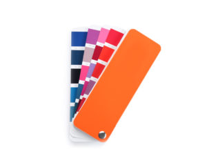
Use similar saturation families or use colors that complement each other. Make use of online color combination tools such as Paletton or Canva!
Tip 6 – Have a focal point
Don’t let your design elements compete for the viewer’s attention. There should be a starting point so it won’t look messy. Mostly this is the graphic with a simple text design to support the icon.
Tip 7 – Clear Elements

Have enough space around your design elements. Make sure that there is proper contrast with your background too. Make your design and text easy to read, recognize, and remember.
Need help with your everyday graphic designs? designs that help connect your brand with your target audience? Let us help.

