Colors play a powerful role in shaping how people perceive your brand. They can instantly communicate mood, personality, and values — often before a customer even reads a single word. In branding, color psychology is a crucial factor in building emotional connections with your audience.
While some brands may lean heavily on one primary color, most successful businesses use color schemes — carefully selected combinations of colors applied to their logos, marketing materials, websites, and product packaging. A well-planned color palette ensures consistency, reinforces brand identity, and makes your visuals more memorable.
Here are some brand color scheme ideas to help you create the right impression for your ideal audience.
1. Timeless and Sophisticated

Best for: Luxury brands, high-end services, classic identities
You can never go wrong with black and white. This pairing communicates elegance, authority, and timeless style, which is why many luxury brands rely on it. Black conveys strength and sophistication, while white adds a sense of purity and balance.
Examples: Chanel, Prada, Louis Vuitton
2. Bold and Proud

Best for: Brands that want to stand out and be instantly recognizable
If you want your brand to take the spotlight, choose a bright primary color — like royal blue, crimson red, or sunshine yellow — and pair it with black and white for contrast in text and backgrounds. You can also combine two strong primary colors for a striking effect, such as blue with red.
Examples: Best Buy (yellow & blue), Netflix (red & black)
3. Natural and Organic

Best for: Eco-friendly, wellness, food, and outdoor brands
Draw inspiration from nature by combining greens, browns, and blues for an earthy, calming palette. Use warmer tones like red, yellow, and orange as accent colors to highlight key elements. This scheme conveys freshness, health, and sustainability.
Examples: Whole Foods, The Body Shop
4. Trustworthy and Dependable
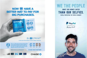
Best for: Finance, tech, healthcare, and service industries
Shades of blue paired with gray and black communicate reliability, stability, and professionalism. Blue evokes trust and calmness, gray adds sophistication, and black brings power and confidence.
Examples: PayPal, Chase, Dell
5. Edgy and Exciting
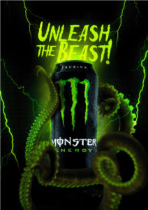
Best for: Sports, entertainment, and youth-focused brands
Pair a bright neon color — like neon green, hot pink, or electric blue — with deep blacks or dark grays. The neon color grabs attention instantly, while the dark tones ground the design and create a bold, high-energy aesthetic.
Examples: Monster Energy (neon green & black), KTM (orange & black)
Choosing the Right Color Scheme for Your Brand
Before finalizing your brand colors, ask yourself:
- What emotions do I want my audience to feel?
- Does this palette align with my brand values and personality?
- Will these colors work consistently across digital and print materials?
Remember, your color scheme is more than just decoration — it’s a key element of your brand identity that influences recognition, trust, and customer loyalty.
Pro Tip: Test your colors across different devices and backgrounds to ensure accessibility and readability.
Want more branding and design tips?
Explore our branding blog for expert insights on color psychology, typography, and marketing design strategies.


