Greatness is often in the smallest details. Being aware of what you should look out for to make your logo design better, even with the smallest adjustments, will do wonders for your design.
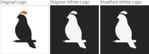
Most people would think you only need to create a white or light-colored version of your logo so you can place it on a dark-colored background.
The problem is that a white or light-colored version of your logo will look “fatter” even if everything’s the same as your main logo design version.

It is an optical illusion called Irradiation Phenomenon.
So what do you do? How do you fix Irradiation Phenomenon?
When creating a version of your logo for dark-colored backgrounds, apply a thin stroke around it, expand, then subtract. Compare the logo designs in both background colors and see if they are visually equal.
Keep it in mind when creating versions of your logo for dark-colored background use.
Check out our blogs for more design tips to take your branding and marketing materials a step higher!