Most of the time you just talk about your service or product, hoping that the right people will become interested. This might work or might just be a waste of your marketing budget. Do you want to gamble your money away? To ensure that you get the best results and make the best out of your marketing budget, we’ve created this list on how to create a persuasive flyer. Below are some elements you can include to optimize your flyer design and make it more effective in bringing in more business. This can work with other marketing materials too, like brochures, posters, and email ads.
1. One Clear Goal
Before you start writing the content for your flyer or thinking about how the design should look, start with having a clear goal in mind for what your flyer is trying to achieve first. Is it to promote a new product, service, or location? And who are you trying to promote this to?
Keep this information in mind when creating the elements below since everything will work together to achieve the intended goal.
2. Attention-Grabbing Headline
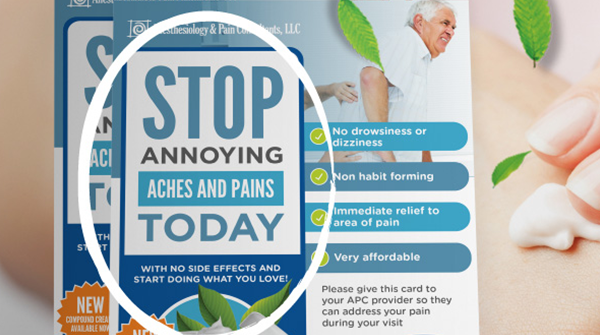
Now that you know what you want to promote and for whom, it should be easier for you to come up with a headline that would catch the attention of your intended audience.
Try to match the tone of your headline with how your target market talks so it’s more relatable to them if your targeting business owners then try to include business-related words.
Another tip, try to talk about the benefit that the product or service brings to your audience. For example, instead of saying that you are offering a new back pain relief cream, you can place “Say goodbye to back pains!” in your headline instead. This will surely call the attention of people suffering from back pains.
Make this part short yet compelling since they should be able to read this in a glance.
3. Interesting Content
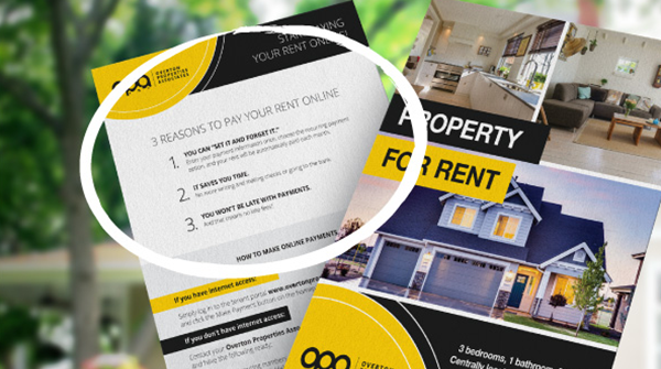
This is the part where you support your headline by listing down the details of your product or service. Try to pair each feature of your product with its benefit so it’s easier for the reader to see why this is important or good for them. If you have a lot of features or benefits to include, use bullet points so it’s easier to read.
4. Desirable Offer
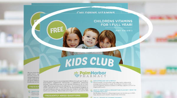
Even though the reader is interested in the product or service, it doesn’t mean that they will purchase or do something about it. A desirable offer will act as a bridge to turn your reader’s interest into action, making their decision process a lot easier.
Some examples of offers you can use:
-
- Early bird deals
- Free Trial
- Free Delivery
- Buy one and get one free
- Discounts
- Limited offer (up to a certain date or for the first 100 customers only)
- Money-Back Guarantee
5. Call to Action
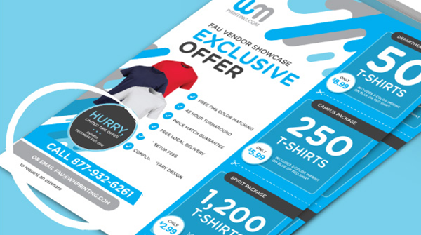
This part tells your reader what to do on what they read to receive the benefits of what your flyer is promoting. Make your call to action stand-out since this is one of the most important parts of the flyer and is the end goal of your marketing efforts. You can do this by placing it in a separate section, by having it in the brightest color, or by placing it on top of a star-burst.
Examples of call to actions for flyer:
-
- Call now
- Email us
- Visit us
- Use this promo code
6. Company Details
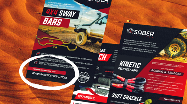
Sometimes the reader will be skeptical of your service, product, or offer no matter enticing it is. They will need to do a background check first to see if your company is legit. Providing your company details will ensure that your company is reputable and can be trusted. Be sure to include your website, email address, phone number, office address, and social media pages, to provide multiple channels for the reader to verify your credibility. This will also provide your reader with an alternative way to reach you if the one mentioned in your call to action is not available to them.
7. Graphics and Images
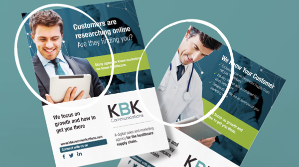
The graphics and layout will tie all the content together into an easy to read and appealing flyer. Try to match the design with your intended audience, if you are targeting high-income customers, make your flyer look classy and have a luxury feel, use classical or light modern fonts with minimal design elements. The images used should help reach the goal and should be eye-catching to the targeted audience.
Try using one large single picture instead of multiple small ones to avoid making your flyer look cluttered. Don’t forget to include your logo and to use your brand colors and fonts.
Remember the design is equally important as the content so it would be best to hire a professional designer rather than doing it yourself.
Try to create multiple variations of your flyer before deciding on which should go for print, at least two should do. If you need a hand with your flyer design or questions on how to create a persuasive flyer, just send us a message and we’ll be happy to help.

