“Contrast” in design is the difference between the two elements and is one of its fundamental principles. Something you should keep in mind when designing your branding and marketing materials.
The most common use of contrast in marketing design is how to make your texts pop out or be easy to read. But there are more ways you can utilize this to take your ads and posts to another level
Adding Focus
Lead your viewer’s eyes to a particular section or object in the design. Apply a different design quality compared to its surroundings. You can do this through colors, textures, sizing, layout, and orientation. You can also add a lot of negative space around it.
Making Comparisons

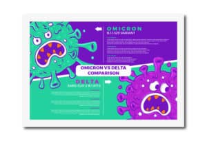
It’s easier to visually show the difference between two things or topics with contrasting section backgrounds. It’s a design style commonly used with comparison infographics.
Creating Sections

Make your marketing materials easier to read and digest by dividing them into smaller sections. You can emphasize or create separations through contrasting backgrounds and layouts.
Visual Hierarchy

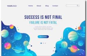
Guide the viewer’s eyes using contrast and create a visual hierarchy. With this, your viewers will know what to look at first. You can see this with header texts having darker colors and larger font sizes than the rest.
Breaking Monotony
Nobody wants to look at boring designs and layouts. It feels like a chore to go through and read. Make your designs more exciting and interesting by adding contrasts.
There are a lot of uses for contrast, the reason why it’s so crucial for your branding and marketing designs. Keep this design principle in mind for your next project, and take it a step higher.
Want to improve your branding and marketing designs? Check out our blogs for more tips and content like this!

