Professional logo designers pour their heart, soul, and expertise into every project. Your logo isn’t just a pretty image — it’s the cornerstone of your brand identity. That’s why knowing how to properly use and maintain your logo is essential for protecting your brand’s professional image.
Unfortunately, many business owners unintentionally make mistakes that not only damage the logo’s integrity but also hurt the overall brand perception.
Here are the top logo designer nightmares — and how you can avoid them.
1. Stretching the Logo
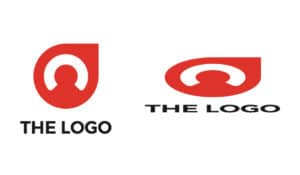

Nothing makes a logo designer cringe more than seeing their perfectly balanced design stretched out of proportion.
When resizing your logo:
- Always scale it proportionally to maintain the correct width-to-height ratio
- Hold the Shift key when resizing in most design software to lock proportions
Distorted logos instantly look unprofessional and can make your brand appear careless.
2. Editing the Design Without Permission

If you need a change — whether it’s adjusting colors, spacing, or layout — contact your logo designer instead of making edits yourself.
Why? Because:
- Unauthorized edits can break the design’s balance
- The updated version might no longer align with your brand guidelines
Your designer can provide a professional, high-quality update that maintains brand consistency.
3. Using the Logo with a White Background (When You Shouldn’t)

This happens most often when using a JPEG file instead of a PNG with a transparent background.
The result? An awkward white box around your logo when placed on colored or textured backgrounds.
Avoid this by:
- Always requesting a transparent PNG version of your logo
- Using the correct file format depending on the background
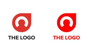
4. Using the Wrong Logo Variation


Professional logo designers often provide multiple logo variations for different scenarios:
- Full-color version
- Single-color version
- Light-background version
- Dark-background version
- Icon-only version
Using the wrong variation can make your logo hard to read or clash with your design. If you’re unsure which one to use, ask your designer or refer to your brand style guide.
5. Pairing the Logo with Poor-Quality Designs


A high-quality logo loses its impact if placed alongside unprofessional branding and marketing materials.
For example:
- Low-resolution images
- Cluttered layouts
- Mismatched colors and fonts
Remember: your logo is just one part of your brand’s visual system. Keep your entire branding consistent to maintain a strong and professional image.
Final Takeaway
Your logo is one of your most valuable brand assets. Treat it with care by:
- Not stretching it out of proportion
- Not editing it without your designer’s approval
- Avoiding improper file formats
- Using the correct logo variation for each application
- Pairing it with high-quality, consistent designs
Pro Tip: Ask your designer to create a brand and logo usage guide. This document will outline the correct way to use your logo in every scenario, ensuring consistency across all your marketing materials.
Want more branding and design tips?
Explore our branding blog for professional advice on logo design, visual identity, and marketing materials.
Need help? Send us a message and we’ll help you create a logo usage guide to protect your brand identity.


