Even in the age of the internet, digital marketing remains a powerful asset for any business that targets their immediate locality. It’s also a great way to promote your brand to a captured audience like people waiting in line and have nothing else to do. The downside to printed marketing materials is that there’s no way to correct your mistakes but to print another batch, which would double the cost of your ad campaign. So how do you avoid or minimize any costly misprints with your print design projects? Continue reading below to find out.
1. Set your color mode to CMYK
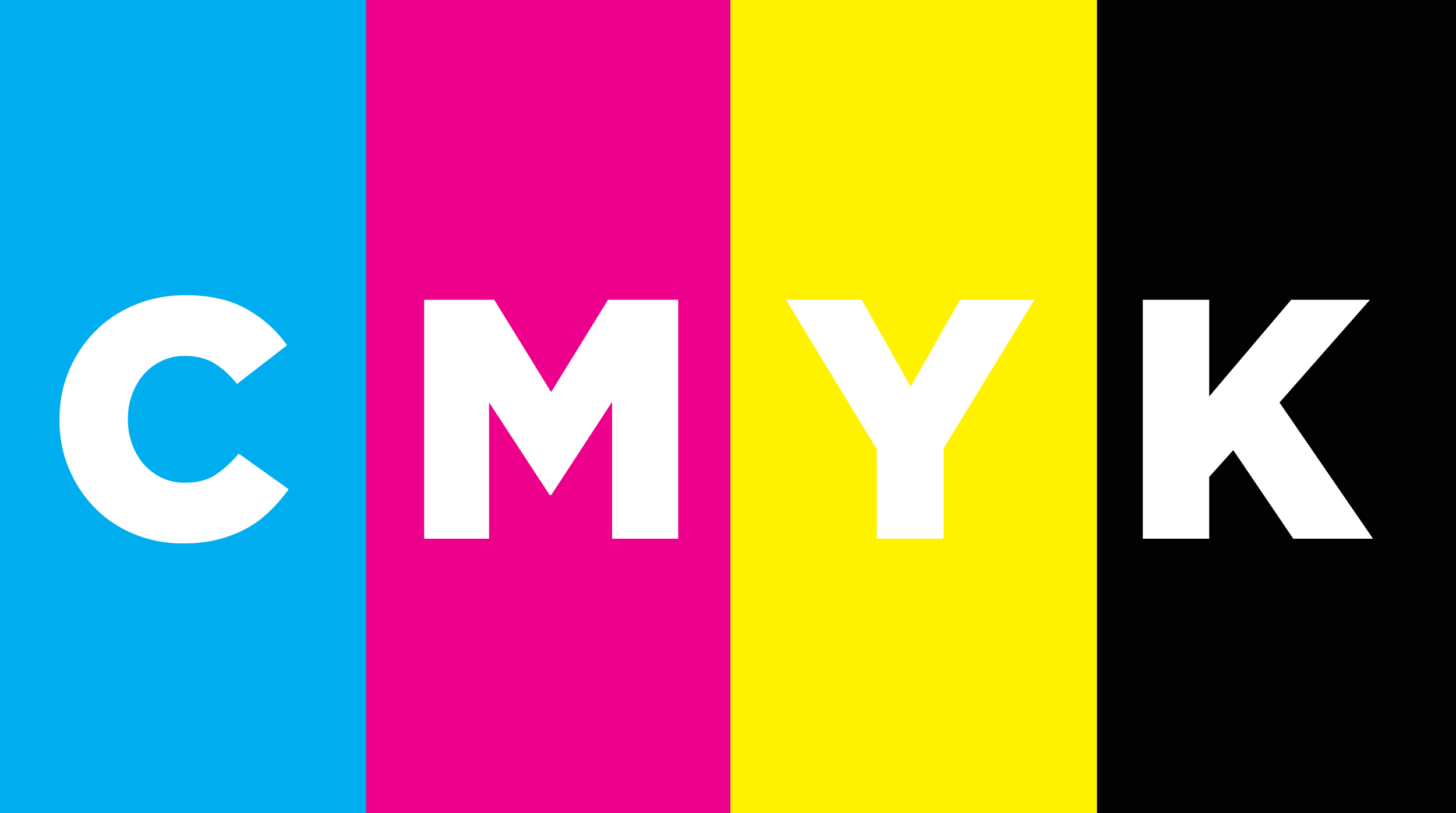
CMYK stands for cyan, magenta, yellow, and black. These are the colors used and combined when doing prints. There is one of the two color options presented when doing design projects. The other option is RGB, which stands for red, green, and blue, which is for digital designs. Be sure to set the correct color mode before starting with your project.
2. Set your resolution to 300 dpi
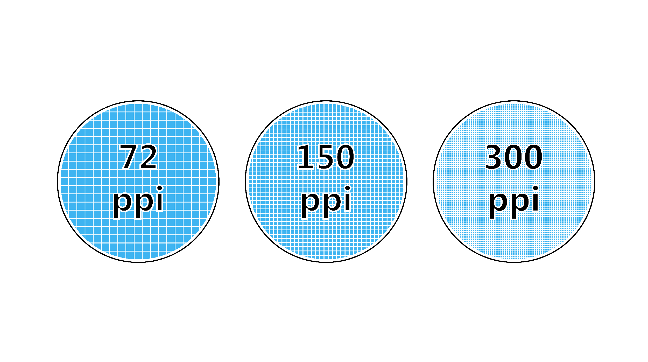
300 dpi is the optimal resolution for print design projects. There are some exceptions. You can set it at a lower resolution the further the printed material will be viewed from like a billboard.
3. Avoid having a font size below 8 pt
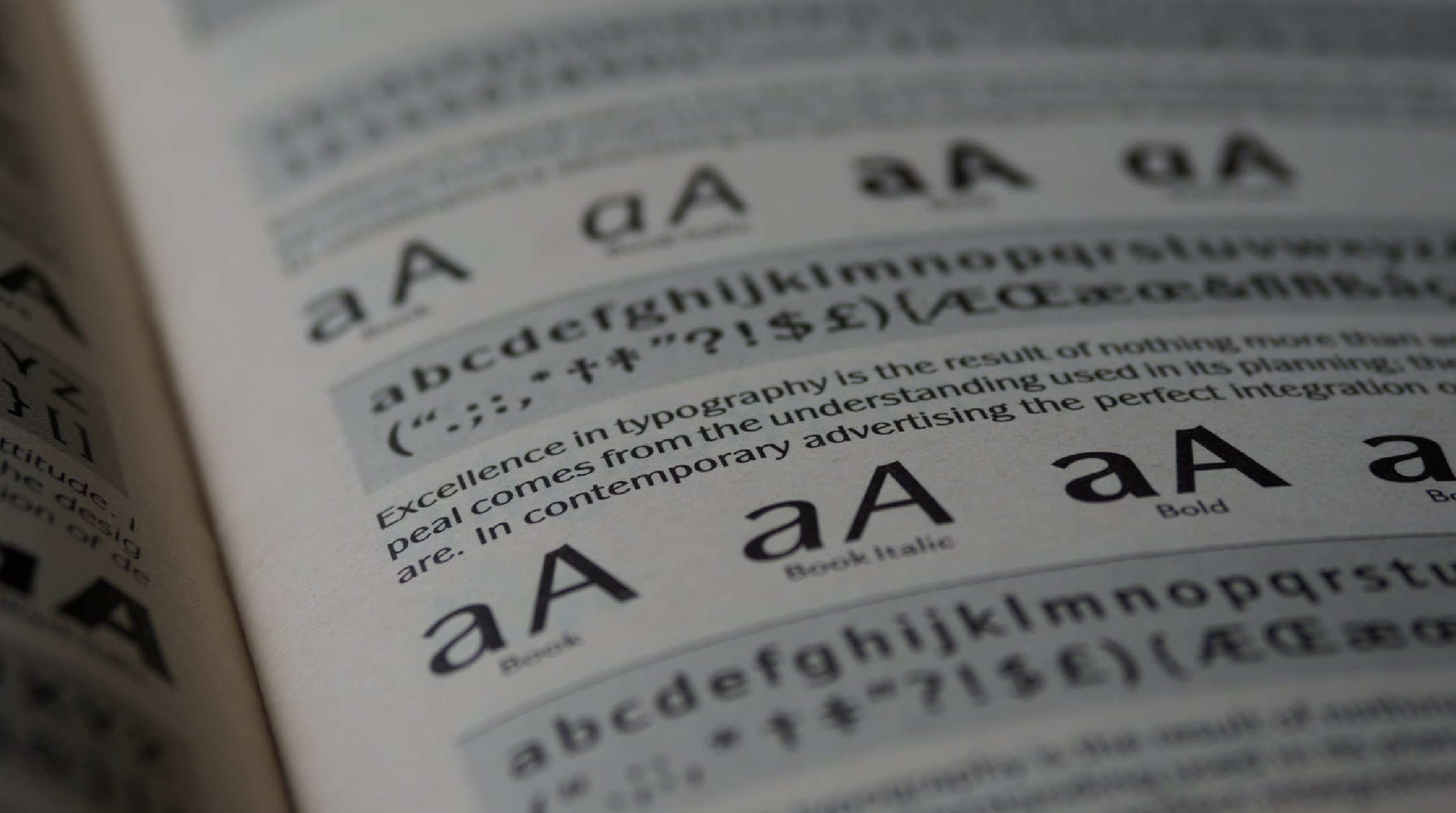
What’s the use of trying to fit all your text in your print material by setting it on a small-sized font if no one can read it? Anything below 8 pt is already hard to read. I would suggest to have it at 11 pt or higher to be safe.
4. Use high-resolution images
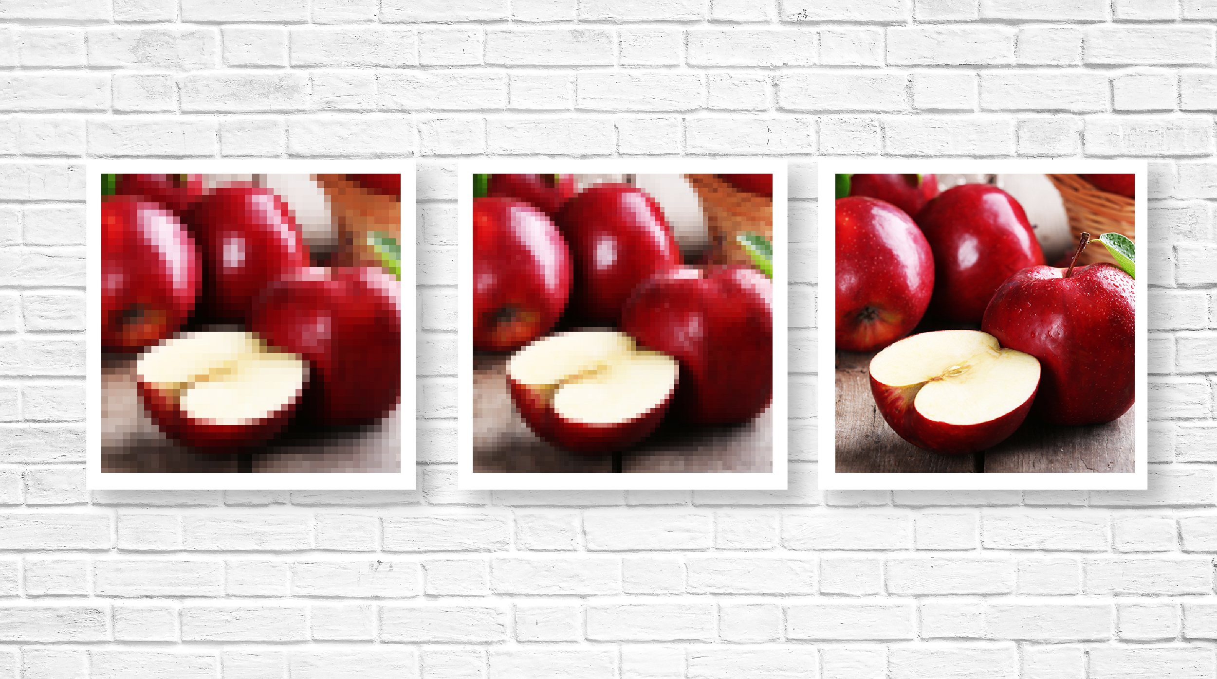
Even if you set your project at 300 dpi at the start, you will still have a pixelated print if you use a low-resolution image. The larger your print size, the higher the resolution you need. A 300 px or dpi is the ideal resolution for an image to print clearly. Avoid grabbing images from google for your designs since these are surely low resolution and is only usable for digital view.
5. Set your artboard to match your print material
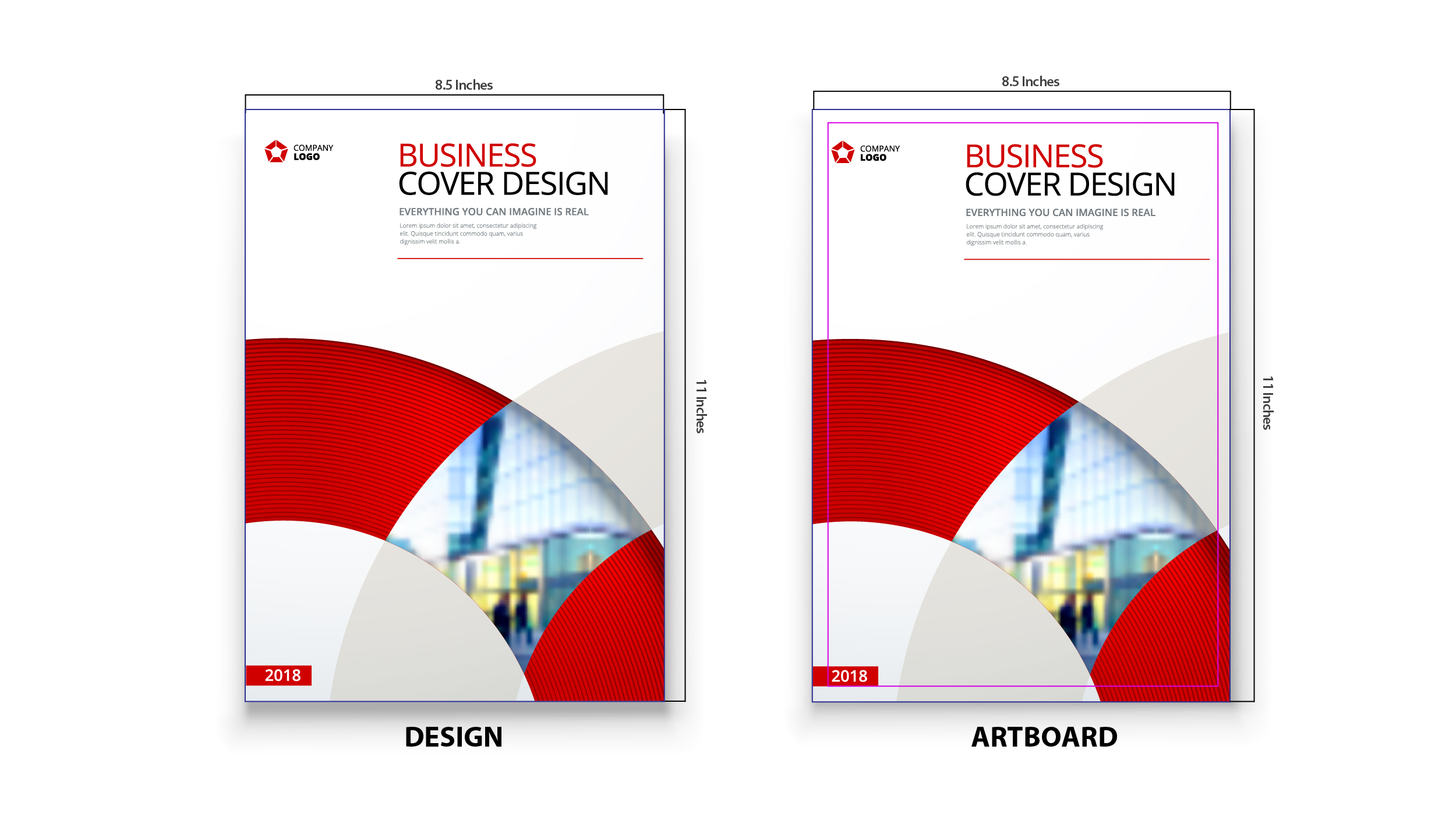
Your designs will be distorted if you try to force print your project on a material that does not have the same size as your file. There is a high chance that the printing company will advise you to adjust your file first before they proceed with prints. Be sure you have the exact size of your print material before doing the design to avoid spending additional time adjusting your content to the correct size.
6. Add bleeds and safety margins
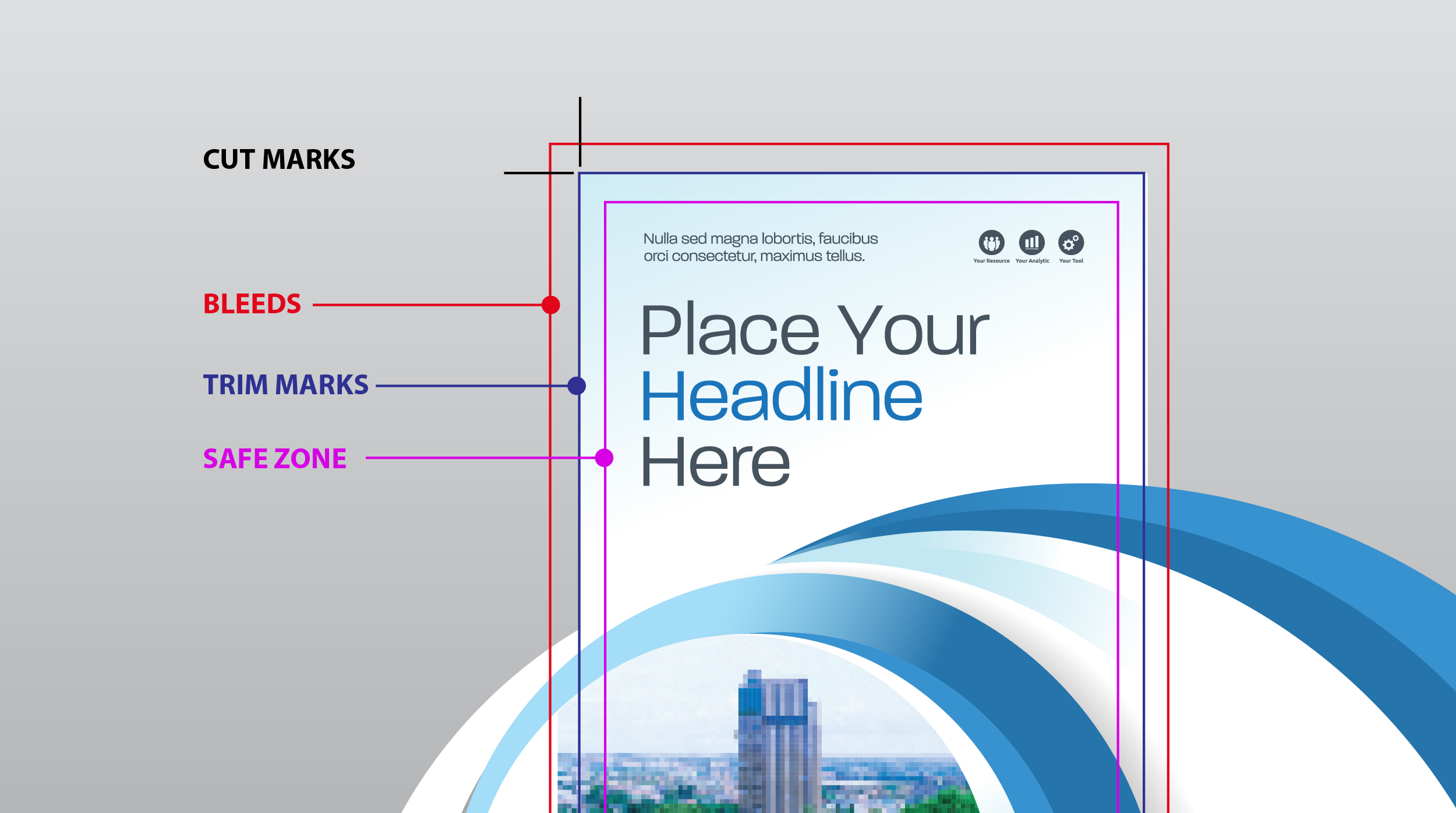
Bleeds and safety margins are two essential elements for your print files. There are some exceptions with the print bleeds like print designs on magazine ads, be sure to consult with your printing company.
Printing bleeds are the added space for your design outside your actual print size or cut lines. It gives the machine a safe margin of error when cutting your materials.
Safety margins are the space towards the inside of your print design, away from the cut lines. It ensures that no necessary elements get cut off.
7. Review all content before printing
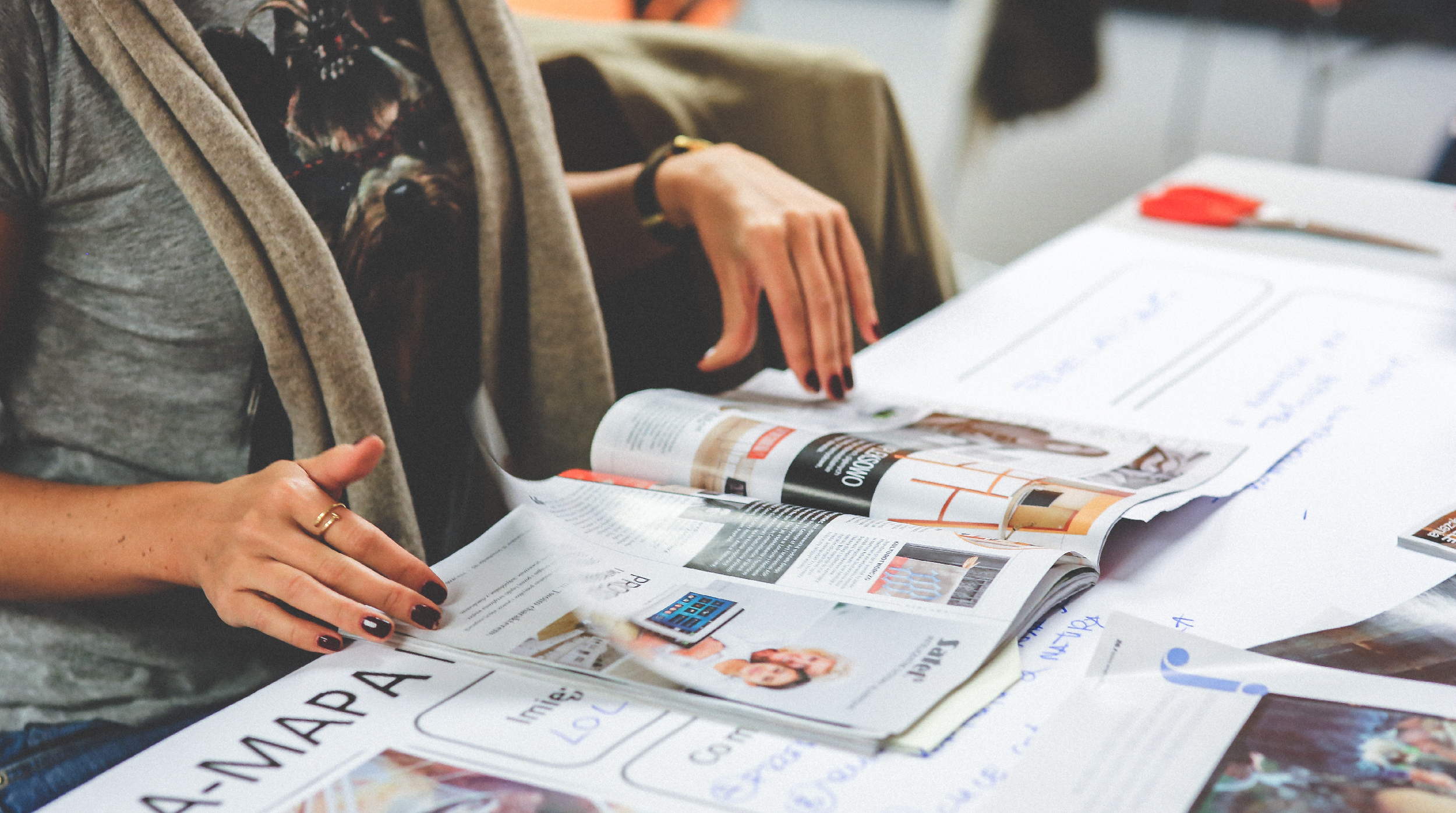
Be sure there are no incorrect grammar or spellings on your copy before going to print. Read it multiple times to be sure. Your designers are often too focused on the designs, be sure you have this covered.
Haste Makes Waste
We have partnered with a printing company for almost a decade already. These are just some of the things we’ve learned from our experience working on printed marketing material designs.
Be sure to go through all 7 of the tips above to avoid costly mistakes. I know it takes time, but this sure beats wasting your money on print design projects which you can not use.
If you need help with your print design project, be sure to send us a message.

