Modern Fitness Brand Logo Design and eBook Layout
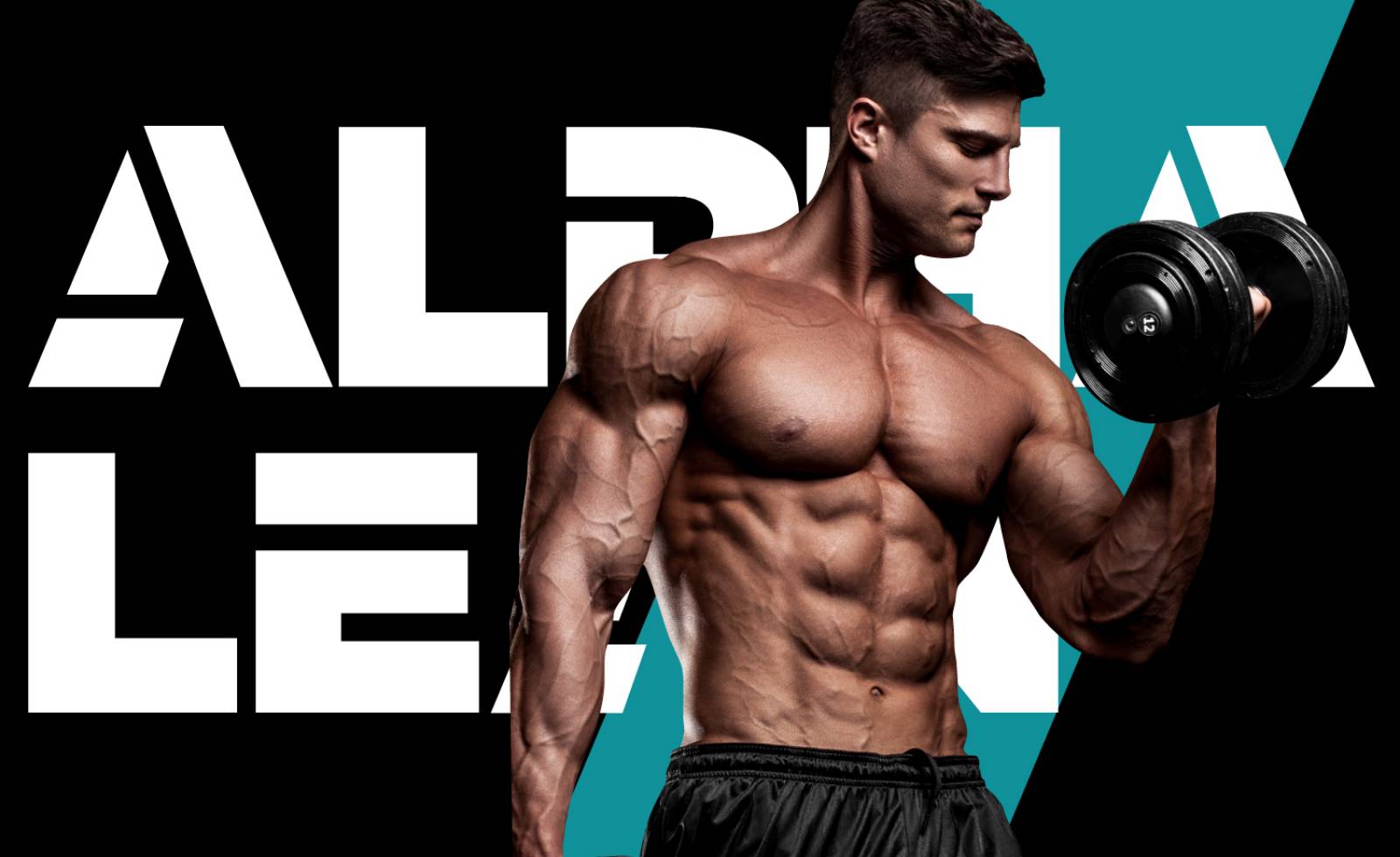
Alpha Lean is a modern food supplement brand in Australia made for 25 to 40-year-old men. The intended audience is mostly professionals and fitness enthusiasts that don’t have the time to workout at the gym. The brand aims to help maintain their healthy and fit build through easy and real results without the frills. Alpha Lean offers a line of food supplement products that helps give their consumers an athletic body that allows them to not only look good but be functionally fit as well.
The Logo and eBook Design Challenge
The client wanted a logo with a solid and bold font using only black and white so that the brand will give off an impression of strength and masculinity.
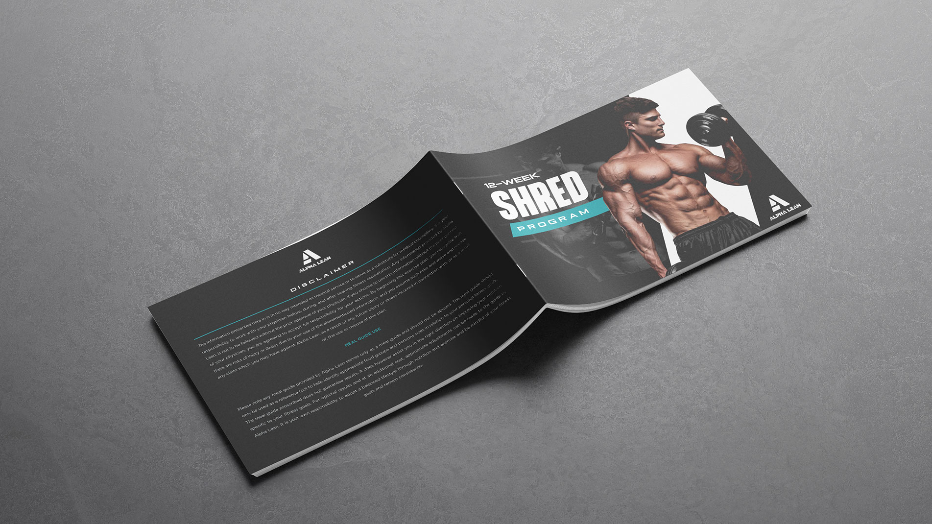
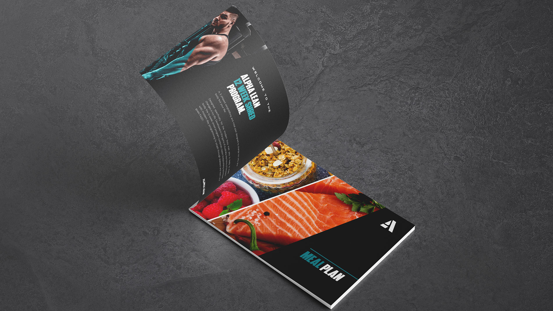
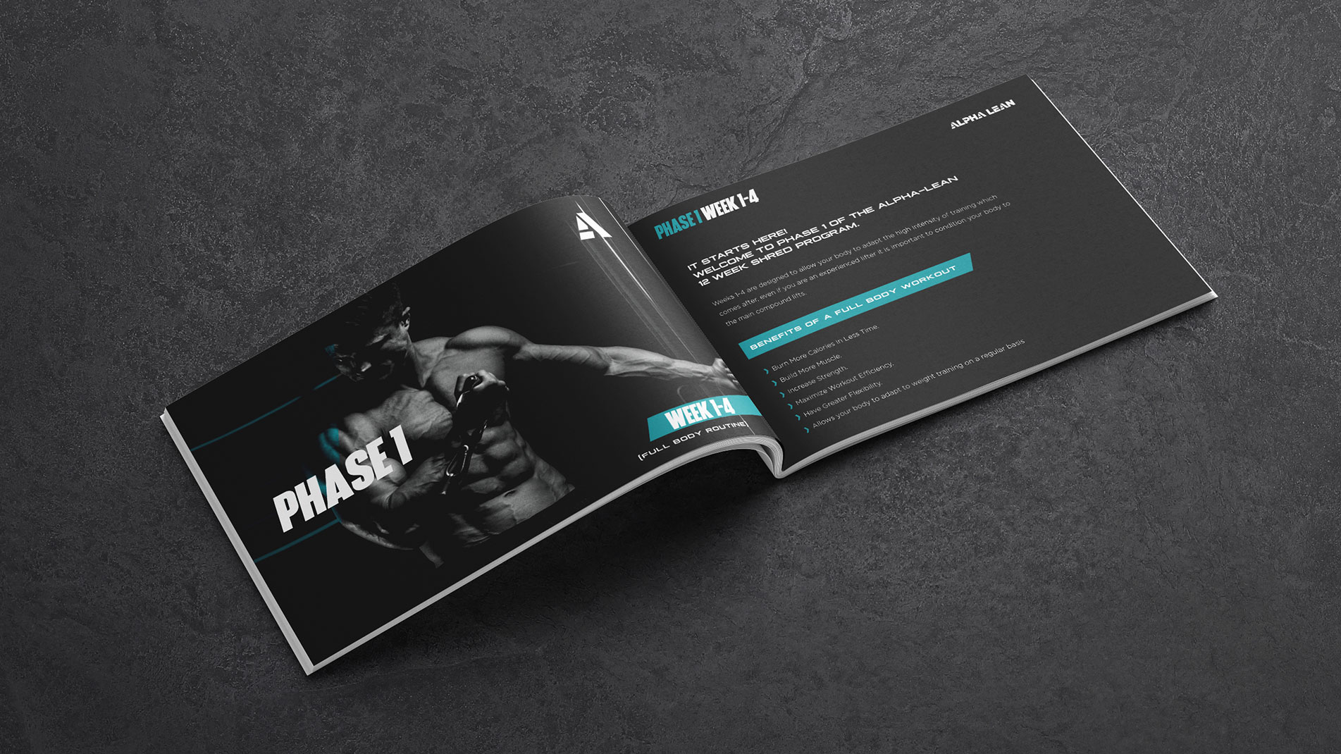
Once the logo design is finalized, they want to have an ebook designed as well. This will be a 12-week fitness program ebook that they can use as a lead magnet.
“The general feel of the ebook should be dark and masculine with color used sparingly to draw attention. Colors I like are Strong Yellow, Dark Red, Deep Turquoise”
Our Solution
We provided a set of logo design proposals that reflected a strong, masculine design yet having that clean and simple look. This is in-line with the brand’s promise to provide easy and real results for men who want an athletic body without the hassle. We also presented the logo designs against different background colors to show how adaptable and well it works on different applications.
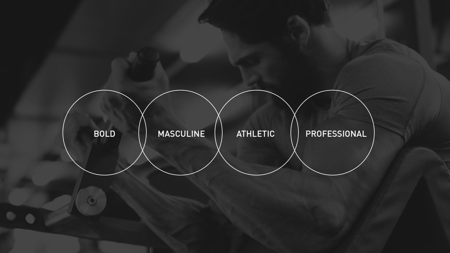
First, we discussed with the client what their brand is about to get a clearer picture of what needs to be done with the design and what the proper design direction to take. These are the keywords we’ve discovered in the process that captures the essence of the brand.
Initial Logo Design Proposals
We presented three options to the clients based on the brand’s definition and keywords. Each were designed to be as simple as possible to show the no-hassle attribute of the product. The shapes used were bold and solid to give it that masculine and strong look.
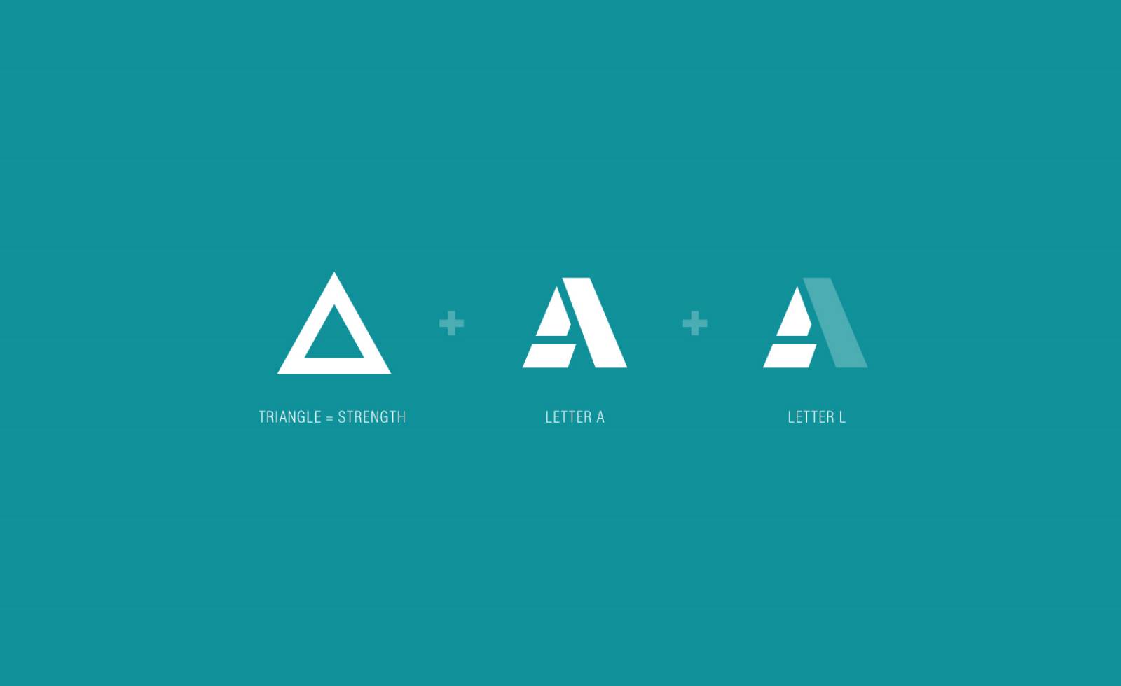
A lettermark logo proposal in which the letter A is on top of the letter L, forming an upward triangle that represents masculinity. It symbolizes being an alpha male, their aspirations, and their desire for dominance.

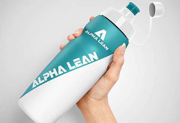
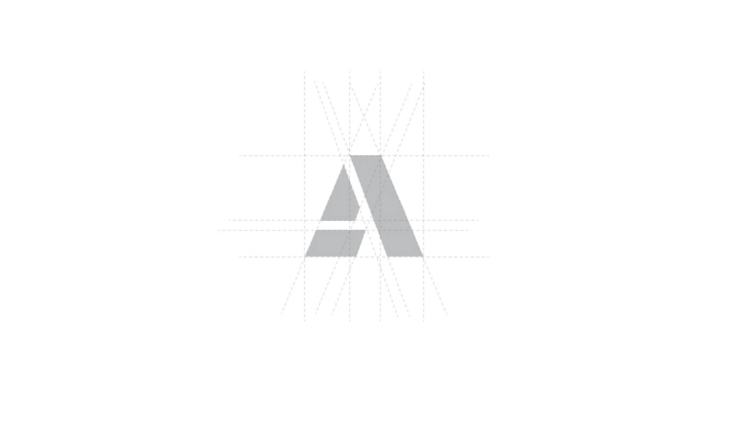
The letter A as the main symbol while the subtle letter L is placed on the left side which also forms a triangle. Clean, bold, and simple.
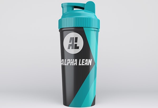
“I love number 2 and 3. I can’t decide between these. I love the elements of both. I love the italic on the long test logo of 3 and the simplicity of the shape logo on 3. It’s a great start. Would there be a way to combine the elements of the 2?
But very impressed gives me great confidence in the ebook!”
The Result
The eBook Layout and Design
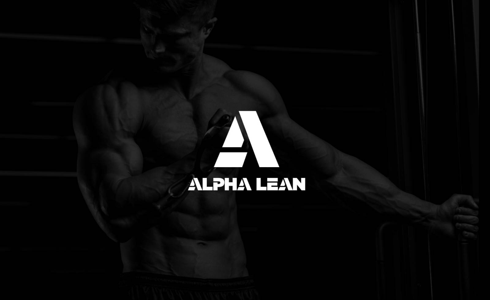
With the finalized logo, the next step for us was to work on their 12-week program fitness eBook. The client provided us with the content along with some images we can work with for the layout. We were able to create a visually engaging marketing material which is easy to read and understand using design elements from the approved logo design.
