Elevating a Hawaiian Frozen Treats Brand Design
A brand design project for a colorful frozen dairy treats product by a food and beverage company based in Hawaii, USA. The brand visual elements will be applied to their corporate identity like their business cards, website, product labels, marketing, and sales materials.
The Frozen Treats Brand
The product that needs to have its own branding under the mother company is frozen dairy treats. It’s a delightful dessert that combines creamy textures and refreshing flavors. It’s made with high-quality dairy ingredients, offering a sweet and indulgent experience that satisfies your cravings for frozen goodness. It has a lot of colors and flavors which certainly catch your attention. It’s a fun and happy product that helps you feel cool and refreshed which is perfect for the Hawaiian weather.
The Challenge
In the competitive landscape of the food and beverage industry, branding poses unique challenges. Establishing a strong brand for frozen treats product requires navigating a saturated market, capturing consumer attention, and creating a distinct identity that resonates with the target audience. It demands a careful balance of differentiation, authenticity, and consistency to stand out from competitors and build customer loyalty in a dynamic industry where tastes and trends are constantly evolving.
The Design Solution
Have the brand design visual elements reflect the fun and happy nature of the frozen treats product while maintaining a professional and trustworthy look. Bright, colorful, and happy-toned colors will be implemented but sticking to only two primary ones, so it doesn’t look overwhelming.
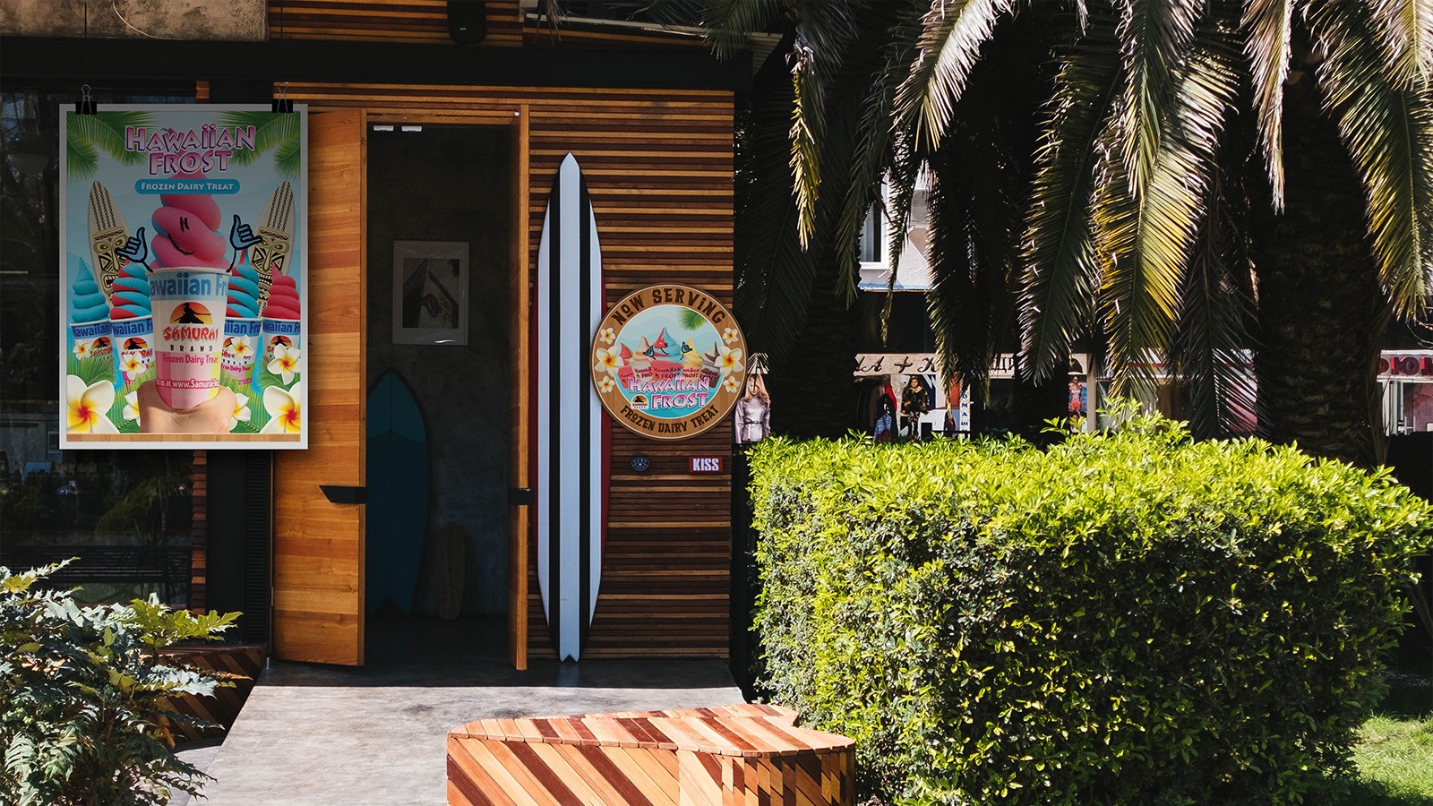
To help differentiate the frozen treats brand design, we will be showcasing its Hawaiian roots by using design elements that will represent this. These are the blue wave patterns, wood texture for the background, palm leaves, and the white with yellow burst plumeria flowers. It shouldn’t be overdone though and only be applied as visual accents so it doesn’t look tacky.
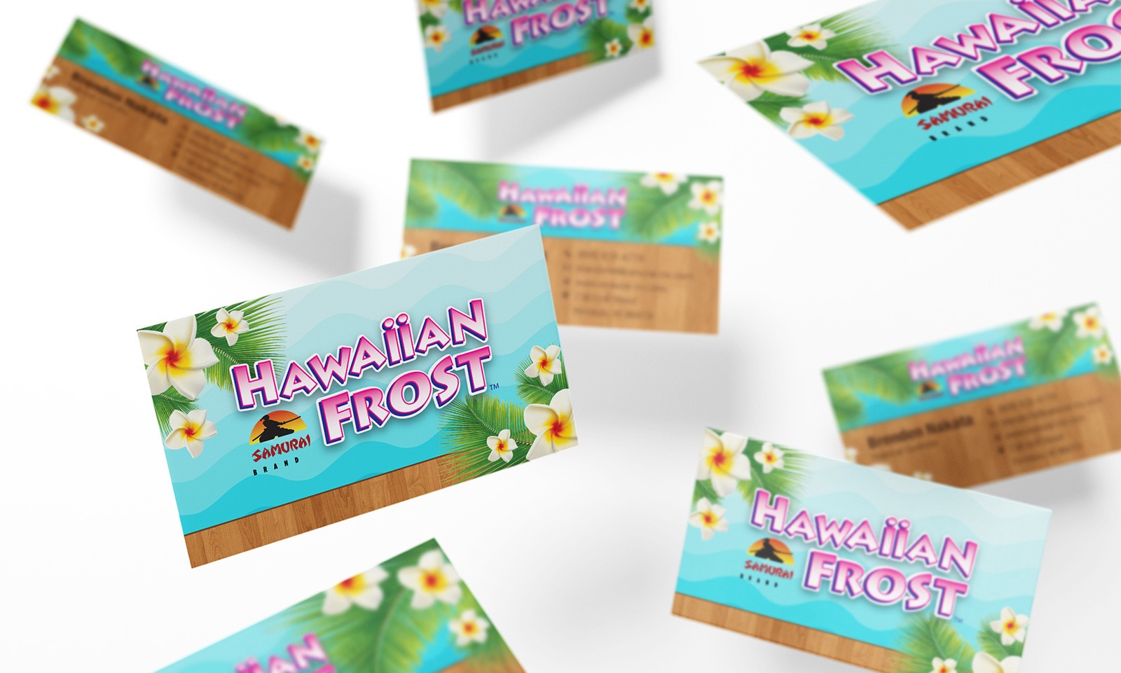
Tropical Business Cards
The brand name is the focal point for the back side of the card, complemented by the established brand elements on the sides. Even with all these visuals existing in a small space, it doesn’t clash since proper visual hierarchy is implemented in the layout. On the front, we have the brand name at the top with the personal details placed on a wooden background at the bottom. It gives it that laid-back and organically engraved feel for the design.
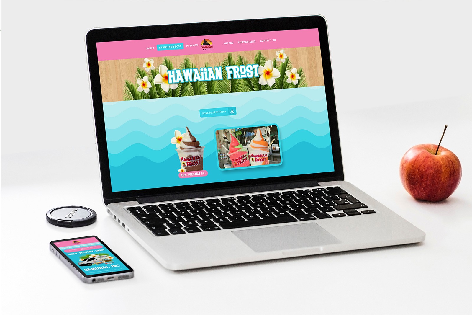
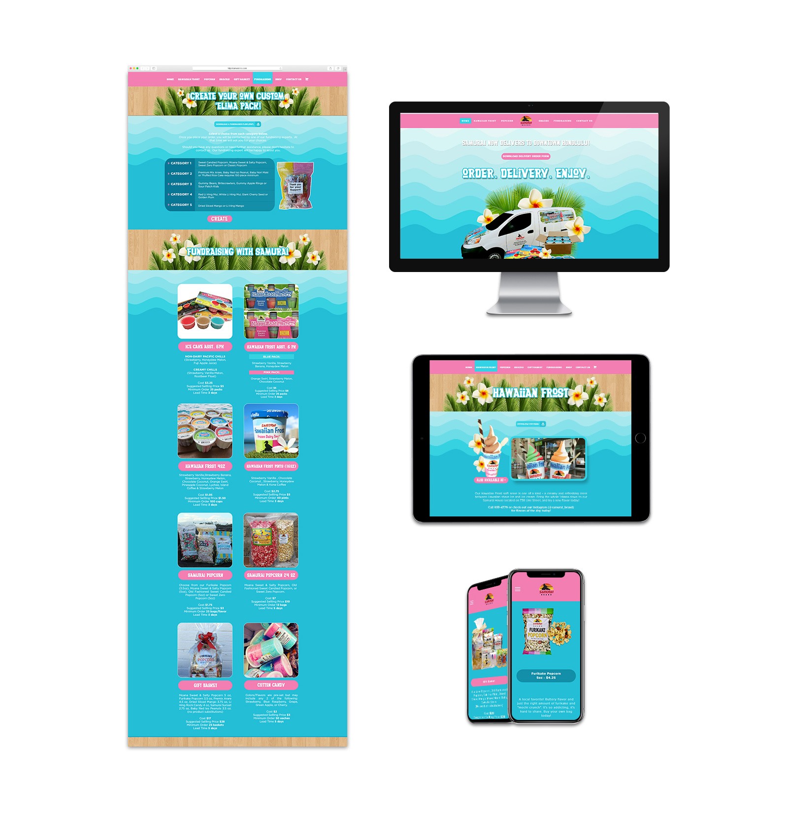
Fully Branded and Custom-Made Website
Powder blue is used as the main color throughout the site to give it that relaxed and comfortable feel. The wave elements will make you feel that you are enjoying or looking at the product by the beach in Hawaii. The provided product logo uses a pink gradient so we used that as the accent color for the site design. To add the Hawaiian vibe to the website design, we used wood texture, palm leaves, and plumeria flowers for the header and section banners. The result is a friendly, fun, and inviting look and feel for the site. Aside from the website design, we also developed it on Squarespace.
Not Your Boring Product Catalog
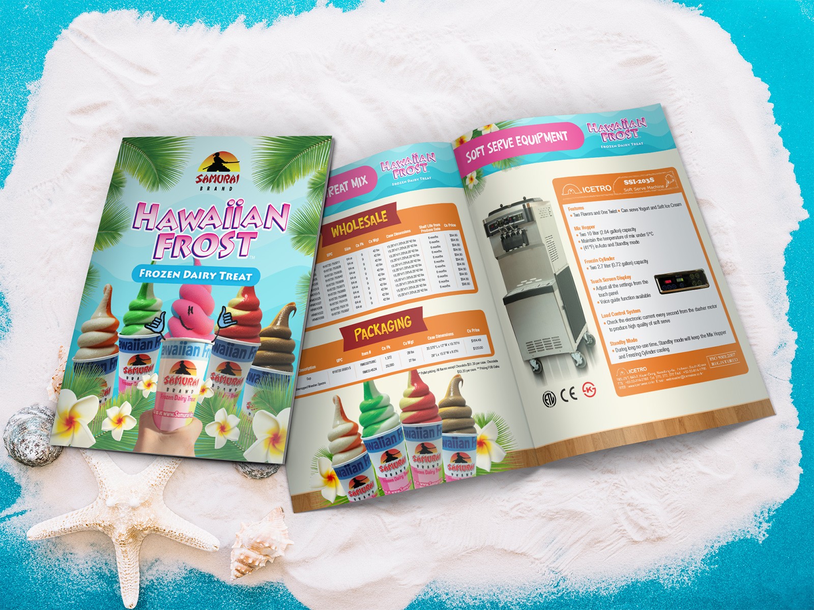
Most product catalogs are cold and boring but not for this frozen treats brand. It maintains the fun, friendly, Hawaiian look and feel that has already been established on the business cards and website.
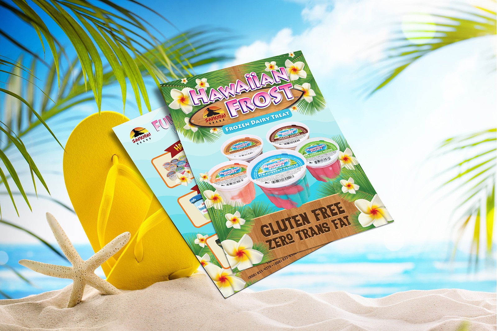
Eye Candy Marketing Flyer
The brand and products are in the main spotlight of this double-sided marketing flyer design. The front side is more on graphics with less content since it’s designed to grab your attention first. Once we’ve caught your curiosity, the details can then be read on the back. It’s a two-step combo for this flyer design that goes beyond aesthetics alone. Check out our blog post if you need help creating an effective marketing flyer like this.
Consistently Tropical Treat
It’s important to establish the key visual brand elements based on the goals of the frozen treats brand and its persona as what we did here with the business card. With that in place, it was easier to design the rest of the branding and marketing materials like the website and product catalog. With a consistent look for all customer touchpoints, it makes the brand look professional, established, and highly organized which then gives an impression that you’re trustworthy and worth investing in or buying from. Don’t hesitate to send us a message If you need goal-driven branding and marketing design support for your products and services.

