Branding, Logo, and Marketing Graphic Designs for a Real Estate and Properties Company
Branding, marketing materials, website design and development for a real-estate business focusing on families.
Overton Properties Associates is the trusted leader in reliable single-family and small multi-family residences. Their properties offer classic features such as hardwood floors, large living areas, and spacious living areas.
Our aim was to create a look that is professional and established yet friendly and approachable enough for the intended audience.
The Challenge
The PUGO team is tasked to create effective marketing designs for Overton Properties Associates. The designs are carefully and strategically conceptualized to enforce and strengthen the brand.
Through in-depth analysis and constant collaboration, we had a clear idea of the company’s vision, goal, and identity. We factored these properties into our design proposals and studies. We strived to create a look that is professional and established yet friendly and approachable for Overton Properties Associates’ audience.
The Logo
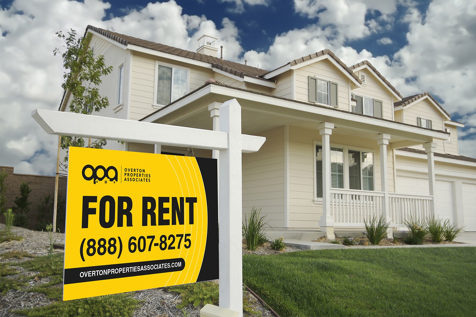
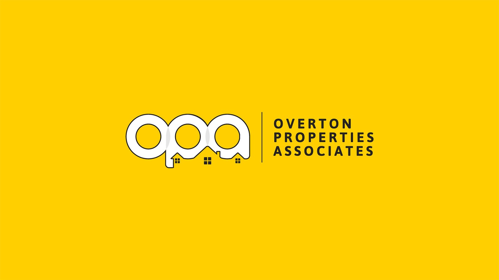
Black and yellow are the standard colors of the construction and real property industries. To make Overton Properties Associates more associative with these industries, we incorporated these colors into the logo.
The logo integrates a stylized outline of houses that are arranged to form the acronym of the company. Square windows draw the eye to the outline of the house, enforcing the company’s industry.
The stylized “OPO” acronym denotes the three company values: expertise, professionalism, and excellence.


The Corporate Identity
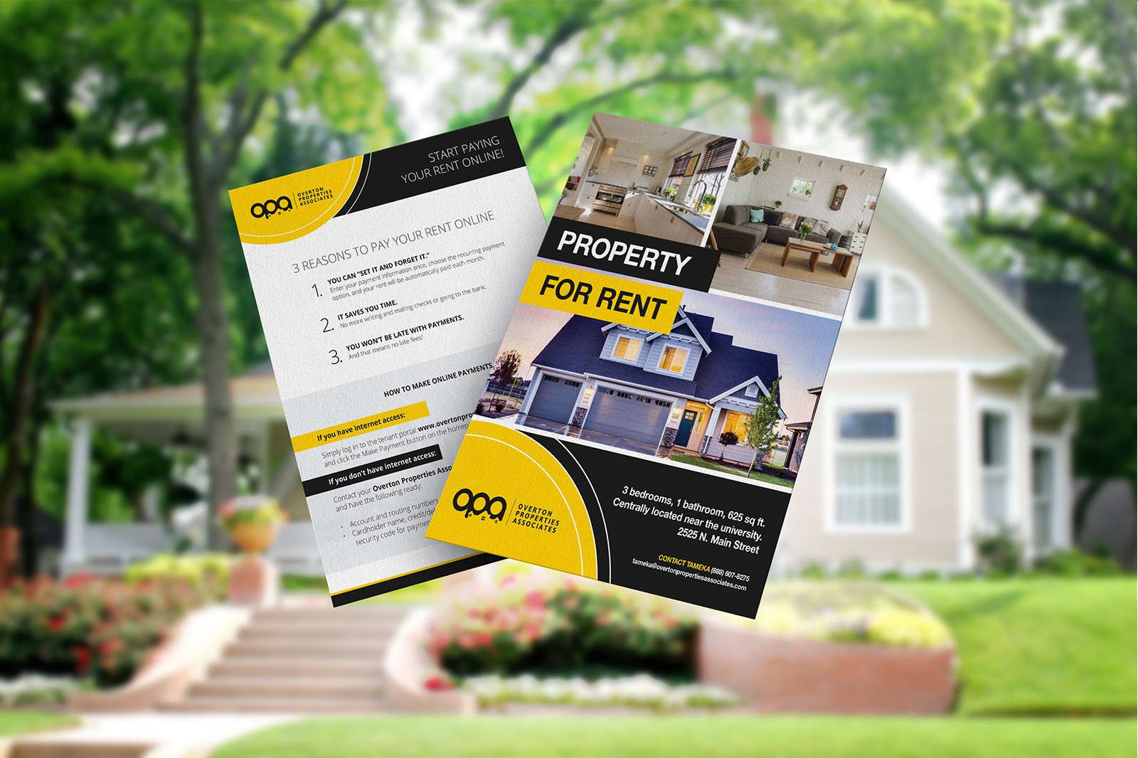
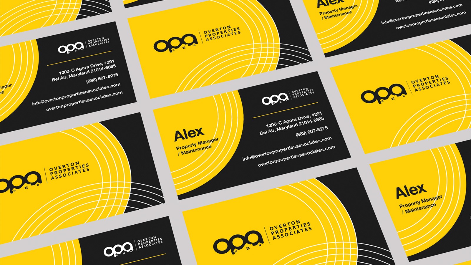
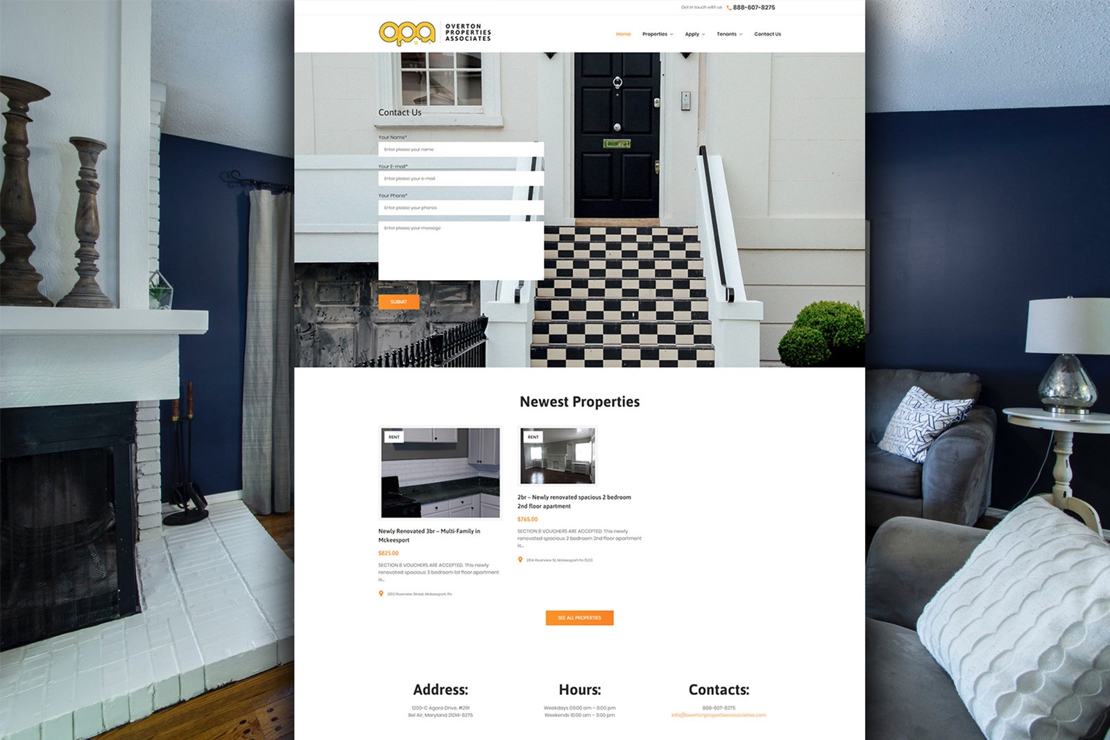
We incorporated the logo and the established colors in Overton Properties Associates’ business collateral such as letterhead and business cards. Black and yellow trim make the collateral appealing and help draw the eye to important content such as names and contact information.
Brochures and Flyers
