Palm Harbor Pharmacy Branding
Independent Pharmacy logo, branding, and marketing material designs
Palm Harbor Pharmacy is an independent, brick-and-mortar pharmacy in Palm Harbor, Florida, USA. Operated by a team of dedicated pharmaceutical technicians, the company dedicates itself to providing patients with quality, affordable medicines.
Palm Harbor Pharmacy also provides innovative services such as prescription transfer, price matching, pharmacological compounding, onsite testing, and more.
The Challenge
Our project goal was to provide the client with a friendly, professional brand identity that represents their mission-vision. We needed to establish colors, hues, and a logo design that will reflect the company’s culture and promise.
Brand Definition
Through a clear understanding of the company’s values and based on our communication with the client, in-depth study, and research, we arrived at a clear brand story and voice for Palm Harbor Pharmacy.
These keywords define the company’s personality, attitude, how they want customers to be treated and point out the company’s mission and what they want to offer to its customers.
Our team thrived to capture a new look that reflects these words:

About the Logo
Our design of the Palm Harbor Pharmacy logo is simple, using a bold (name of the font) font. The simplicity of the logo captures the company’s personality and customer-treatment goal—no complications and no hassles.
The logo encapsulates what customers want from a service provider— simple, friendly, professional, and excellent service.
The Concept

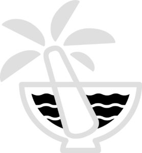
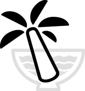
In pharmaceuticals, the mortar-and-pestle symbol historically represents medicine and healing. This is the reason why chose these graphics so it’s easy to see from a glance.
Inside the mortar are the waves to represent the harbor in Palm Harbor. This represents the company’s commitment to serving its customers despite changing times.
The pestle as the palm tree to represent the palms in Palm Harbor. The tree fronds represent the company’s desire of adding value-added services.
The Brand Colors
We chose a simple blue , green and grey as the primary colors for the logo, website, and other marketing collateral. These colors reflect the personality and mood of Palm Harbor.
We paired this with deep seablue , black and white as the secondary colors to contrast the pastel colors
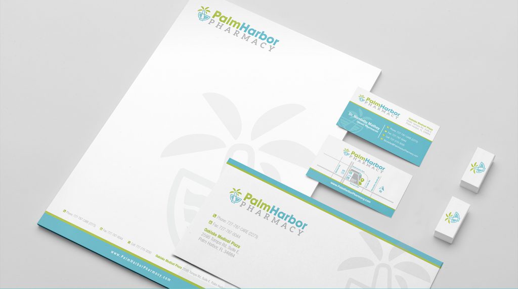
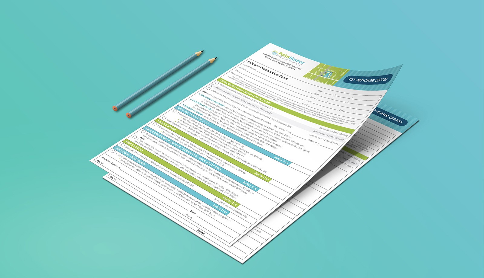
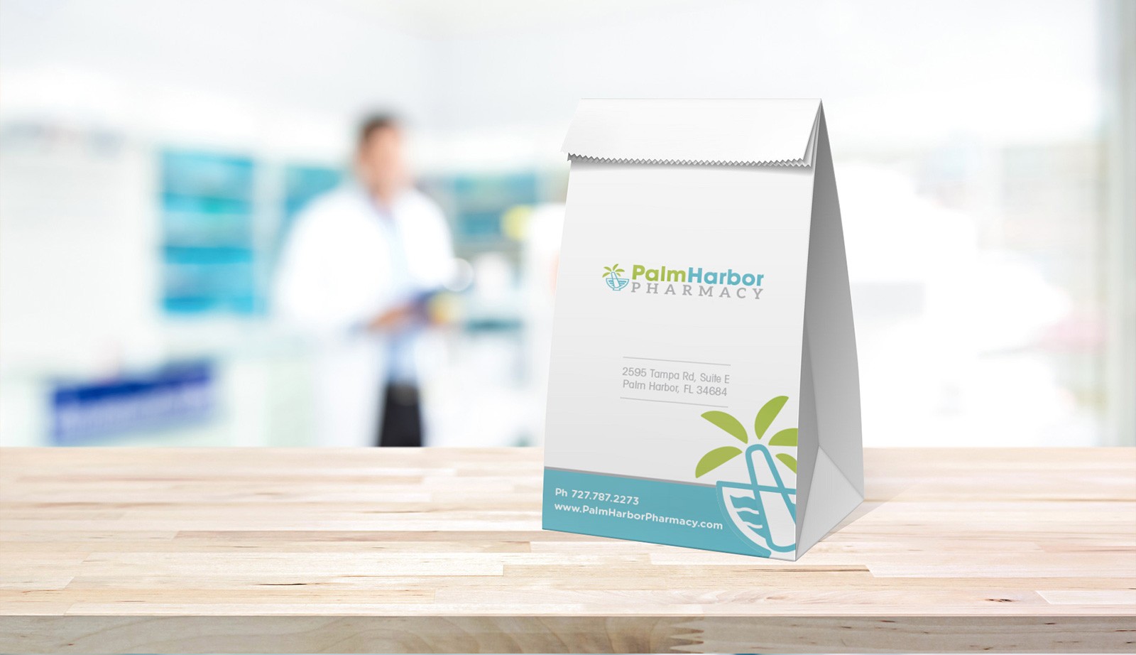
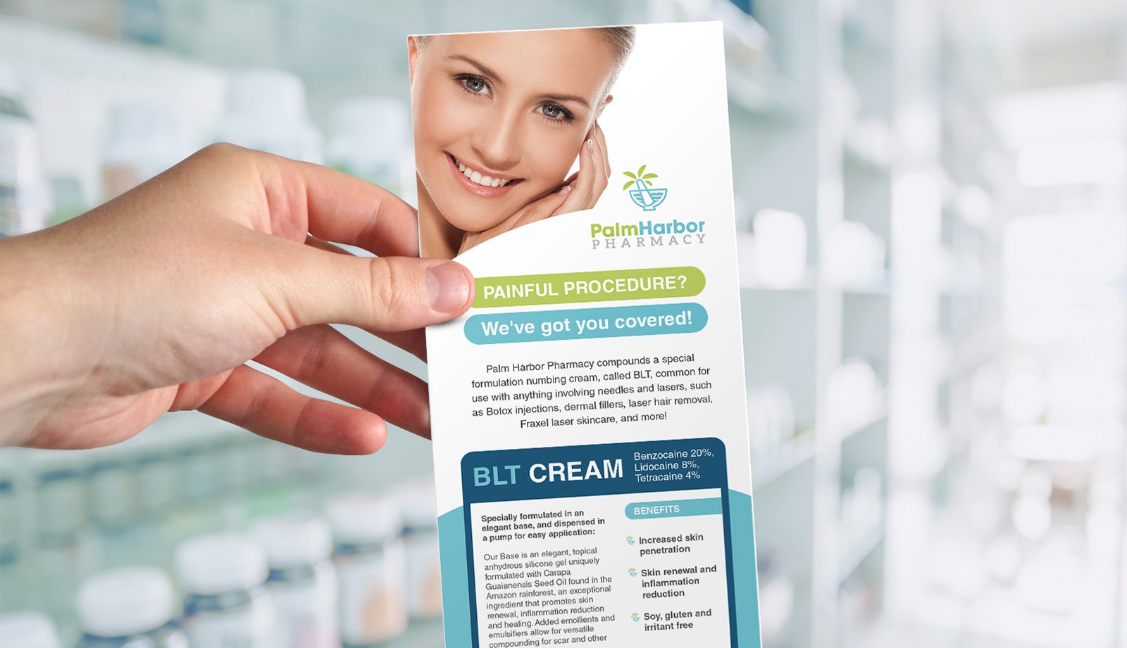
The Branding and Marketing Materials
