Not all colors look good together, and choosing the wrong combination can make your social media designs look unprofessional or off-brand. If you’ve ever struggled to pick the right colors for your social media posts, understanding color scheme ideas can help you make better design choices and maintain visual consistency.
Color psychology plays a big role in marketing—colors influence emotions, brand perception, and engagement rates. By using the right color combinations, you can make your graphics more appealing, easier to read, and more memorable to your audience.
Below are four proven color scheme types you can use to improve your social media graphic design.
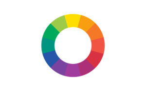
1. Color Scheme: Single Color (Monochromatic)

Keep your graphics clean, simple, and elegant by using only one base color and adjusting its tints (lighter versions) and shades (darker versions). This approach, known as a monochromatic color scheme, is ideal for brands that want a minimal yet cohesive look.
Example:
- Black background
- White text
- Grayscale images
This method creates visual harmony and works especially well for luxury brands, professional services, or minimalist social media aesthetics.
2. Color Scheme: Related Colors (Analogous)
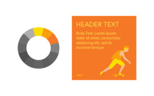
Choose a primary brand color and select the colors next to it on the color wheel for support. This is called an analogous color scheme, and it creates a smooth, pleasing flow because the colors share similar tones.
Example:
- Primary: Orange
- Supporting: Yellow-Orange and Yellow
This scheme is great for lifestyle brands, food content, and nature-themed designs because it feels warm, friendly, and easy on the eyes.
3. Color Scheme: Opposing Colors (Complementary)

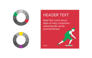
Use two colors that sit directly opposite each other on the color wheel for a complementary color scheme. This pairing creates high contrast and grabs attention, making it perfect for ads, promotions, and call-to-action designs.
Example:
- Red and Green
- Yellow and Purple
While complementary colors are striking, they should be balanced carefully to avoid overwhelming the viewer. Use one as the dominant color and the other as an accent.
4. Color Scheme: Tri Colors (Triadic)
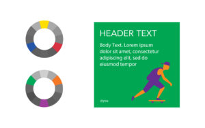
A triadic color scheme uses three colors that are equally spaced apart on the color wheel. This approach creates a bold and balanced look with plenty of contrast while maintaining harmony.
Example:
- Blue, Red, and Yellow
- Green, Orange, and Purple
Triadic schemes are ideal for playful, creative, or youth-focused brands that want vibrant, eye-catching social media posts.
Pro Tip: Use Online Color Tools to Perfect Your Scheme
If you’re not sure which colors to combine, try free color palette tools like Paletton or Canva’s Color Wheel. These tools help you experiment with color harmonies and find combinations that match your brand personality.
Final Thoughts
Choosing the right color scheme for your social media design is more than just picking your favorite shades—it’s about creating a visual identity that resonates with your audience and reinforces your brand message.
Need professional help with your social media design?
Our design team can create goal-driven, visually appealing social media kits tailored to your brand identity.
Do you need assistance with your social media design? Contact us and let’s start collaborating!

