In graphic design, an empty space is not wasted space. This area is called white space. It is the part without any design elements and the gap between each section. White spaces can use other colors and not just white.
So why should you care about white space in your marketing designs? And how does this help improve your marketing assets? Continue reading below and check out the three main benefits.

1. Easy to Read and Understand
Paragraphs with proper spacing between lines and enough side margins make it easier for the readers to read and understand the content of your marketing material. It also makes the texts easier to scan through.
It’s hard to attract your target market when your marketing materials’ text and graphic elements are all over the place, are placed too close to each other, and have no proper spacing between each section. This usually happens when you try to cram a lot of content into a small available space.
2. Gives focus and attention
Adding white space around a graphic element gives it more focus and attention. It helps lead the viewer’s eyes towards a message or a focal point quickly.
If you want to showcase a product in your ad and want your viewer to look at it first, create as much white space around it as possible. An example of this type of design style is one of the ad designs by Apple.
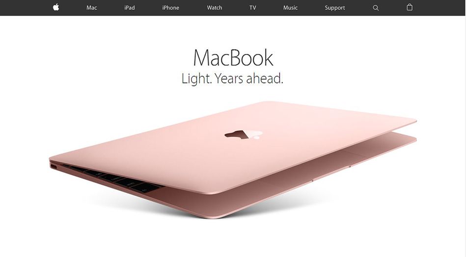
Without proper usage of white space, the viewer will have no idea which part of your design they should look at first. If they start with the boring details, there’s a big chance that won’t continue reading the rest of your content. Unlike if they begin with a catchy header or see your featured product first, they will be more interested to read the rest of the content, and hopefully, act on your call to action.
Be mindful of the amount of space between your texts and images. Related design elements should be closer together. Designs on top of your visual hierarchy can use added white space. It makes it easier for the viewer to decide which part of the marketing design should look first, the next, up to the last.

3. An impression of Luxury and Sophistication
White space can give an impression of luxury and sophistication to your designs. Notice how most luxury brands use a lot of white space for their ads and marketing campaigns?
By adding white space to your designs, this gives a more upscale look and feel to your brand. It helps the viewer focus on your featured product and makes it look more valuable.
Use this appropriately since this is not advisable for all brands. If you’re trying to target an audience in the middle to lower income levels, this might scare them off, thinking that your products or services are too expensive. Just because it looks good, doesn’t mean it’s good for your brand and business.
Conclusion
The white space in your marketing material is just as important as the parts with design and text elements on it. Don’t look at the empty space as wasted space. It is there for a reason. It lets your design breathe. It raises the perceived value of your products and services. It makes your marketing assets worthy of checking out. Use this design element and optimize your marketing assets.