
Levi’s didn’t plan for their best branding moment of 2026. FIFA required the stadium to cover the Levi’s logo during World Cup matches. So someone draped a white sheet over the sign. And the whole world still knew exactly whose stadium it was.
That moment caught our attention. Not because it was clever marketing. Because it revealed something we have been noticing across several major brands lately. The strongest identities are no longer just built around a name, a color, or an icon. They are built around a shape. And that shape is becoming a standalone asset in its own right.
What Is This Trend Actually About?
This is not about redesigning your logo. It is about something brands are quietly adding to their visual identity systems: a shape variation that works completely on its own, without color, text, or any supporting element.Think of it as another asset in your brand arsenal. Alongside your primary logo, your secondary lockups, and your icon mark sits a shape mark. A standalone silhouette that can communicate your brand in contexts where everything else cannot show up. On embossed packaging. On stitched apparel. On signage that someone draped a white tarp over.The brands doing this well have it documented inside their guidelines. It has approved use cases. It has rules. It is not an afterthought. It is an intentional part of the brand ecosystem.
Why Are We Noticing This Now?
Several big brands have made moves recently that all point in the same direction.
 |
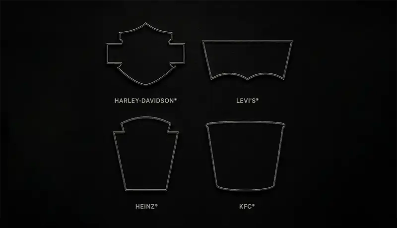
KFC just unveiled a sweeping global rebrand developed with agency JKR that puts the iconic bucket at the center of their entire identity strategy. The bucket has evolved from a packaging element into a visual framework used across communications, physical environments, and digital platforms. It is now both a storytelling tool and a framing device. They are not just using a logo. They are using a shape as the organizing principle of the whole brand system. |
 |
Heinz did something similar when JKR helped them build their first global masterbrand. The keystone shape, which references Pennsylvania where Heinz was founded, became an active design element used as a window, a frame, and a structural device across all 20 product categories internationally. The shape was always there. What changed was how intentionally they started using it. |
 |
Harley-Davidson’s Bar and Shield has been in continuous use since around 1910. It appears on jackets, tattoos, garage walls, and custom parts with no text needed. Over a century of consistent use turned one distinctive shape into something people tattoo on their bodies. |
 |
And then Levi’s happened. WWD noted that the covered batwing became even more noticeable under the white tarp than it might have been left uncovered. Levi’s did not just survive a branding restriction. They turned it into a global news story and a campaign. That is only possible if the shape already had enough power to carry the brand on its own. |
These are not isolated moves. This is a direction. And it is worth paying attention to.
Why the Levi’s Batwing Is the Best Example of This Done Right
From a designer’s perspective, Levi’s has the strongest execution of all the brands doing this right now.
The batwing is remarkably simple. It is a clean two-arc silhouette with no internal detail required to make it work. You can stamp it on a product, engrave it in leather, or cover it with a sheet, and it still reads instantly.
But simple does not mean generic. That shape is completely unique to Levi’s. There is no other brand in the world with a mark that looks anything like it. That combination of extreme simplicity and total distinctiveness is the hardest thing to achieve in logo design. Most shapes are either too generic to own or too complex to reduce cleanly. Levi’s hits both marks perfectly.
| Brand | Standalone Strength |
|---|---|
| Levi’s | Stands entirely alone, at any scale, in any medium, with nothing else supporting it. |
| Harley-Davidson | Carries more internal line structure, which keeps it interesting and connects to heritage. |
| Heinz | Recognizable in context but carries less weight completely on its own. |
This Is Not Just a Big Brand Conversation
The natural reaction to all of this is: that is great for Levi’s. My brand is not big enough to think about this.
We would push back on that.
The brands with powerful shape recognition today did not start out famous. They built it through consistent, repeated visibility over years and decades. The shape became recognizable because the full brand showed up long enough that the outline alone started carrying the memory.
Branding is a long-term investment. Consistent visibility over time is what builds brand value. And every element in your brand ecosystem counts, no matter how small or insignificant it seems at the start.
The smartest thing you can do is think about this now, before your brand is fully established. If your visual identity includes a distinctive shape element from the beginning, you do not need to make any changes later. The asset is already there. You just deploy it in the right contexts as the brand grows. And when a moment like the Levi’s FIFA situation comes along, your brand is ready for it.
How We Think About This at Pugo
We have not had a client project yet where a shape asset was part of the explicit brief. But watching these brands move in the same direction has changed how we approach new logo and branding work.
One of the questions we now build into every logo and branding project is whether there is a shape worth developing as a standalone asset. Not whether the logo needs to become a shape. Whether the brand system we are building has room for a shape variation that belongs in the guidelines alongside everything else.
That question goes into the process early, before concepts are finalized and before the brand is out in the world. Because adding it later is harder. Building it in from the start costs nothing extra and gives the brand something it can grow into.
Every brand element should be intentional. If there is a shape in your identity worth owning, it deserves to be documented, approved, and treated as a real asset. Not an afterthought. Not something you discover by accident when someone covers your stadium logo with a tarp.
What to Keep in Mind for Your Own Brand
You do not need to overhaul anything to start thinking about this. Here are the right questions to ask the next time you are building or reviewing your visual identity:
- Does your logo have a silhouette that is distinctive enough to own?
- Could that shape work without color, text, or internal detail?
- Is there a version of your mark that could live on merchandise, embossed packaging, or a physical environment?
- If everything was stripped away, would the shape alone say something?
If the answer to most of those is yes, you may already have a shape mark worth developing. If the answer is mostly no, it is worth considering whether your next brand identity project should include one.
A quick way to test it: take your logo, convert it to a solid black silhouette, and remove everything else. What you are left with will tell you a lot. Our article on 7 essential considerations for effective logo design covers the other qualities worth thinking about when building a logo that lasts.
Every Brand Element Should Earn Its Place
The brands with the strongest visual identities are the ones where every asset has a purpose. The primary logo tells the full story. The icon mark works at small sizes. The color palette sets the emotional tone. The typography carries personality.
A shape mark, built deliberately into your system, gives you a tool that works when everything else cannot. It is a small addition that compounds over time. And as brands operate across more touchpoints than ever, that kind of flexibility is only going to matter more.
This trend is not going away. The brands building these assets now are the ones that will have more to work with later. Whether you are building a new brand in the US, launching a startup in Australia, or updating an identity that has outgrown its current system, it is worth asking whether a shape asset belongs in your ecosystem.
See our branding packages if you want to build a brand identity with this kind of long-term thinking built in. Or get in touch if you want to talk through what your visual system should include.


