



Cafe 8020: A Logo Redesign Built on the 80/20 Rule of Great Coffee
Client
Cafe 8020
Industry
Coffee shop/cafe
Services
Brand strategy, logo design, brand guidelines
Market
Cebu, Philippines
Timeline
2 to 3 weeks
Results at a Glance
A logo that finally reflects the seriousness behind the name, built directly from the 80/20 coffee philosophy instead of a generic coffee-cup icon.
A visual identity that breaks from the black-and-white sameness of nearby competitors, giving Cafe 8020 its own color and shape language on shelves, signage, and packaging.
A more sophisticated, professional impression that still reads as warm and approachable, matching how the team wanted to be seen.
A complete brand guide and mockup set (mugs, apron, coffee cups, kraft bags, signage) ready to roll out across every touchpoint.
Delivered in 2 to 3 weeks, from brand positioning through the finished guide sheet.
Project Overview
Cafe 8020 is a coffee shop built around a simple idea. Eighty percent of a great cup of coffee comes from twenty percent of the basics: grind size, fresh beans, water temperature, timing. Get those right and everything else follows. That’s the Pareto Principle applied to brewing, and it’s where the name comes from. The team at Cafe 8020 takes that seriously. They wanted a logo that showed it.
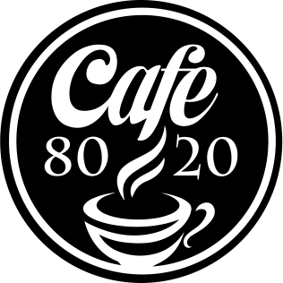
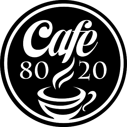
They had already designed a logo themselves. It worked, but it didn’t say what the brand needed it to say. They came to us for logo design services to turn a DIY mark into a professional one, and to give Cafe 8020 a visual identity that matched how seriously they treat their coffee and their space.
The Challenge
4D-SPEC provides high-performance computing infrastructure, managed IT services, and technical consulting for Australia’s mining industry. In simple terms, they help mining companies handle demanding computing and technology requirements without having to build and manage everything themselves. Their expertise was not the problem.
The challenge was communicating that expertise through a brand that immediately felt credible, specialized, professional, and relevant to the mining industry. They were operating in a market where large technology providers such as AWS and Microsoft Azure have strong global recognition. These companies serve many industries, while 4D-SPEC has a much more focused advantage: they understand
Brand Direction & Keywords
Chill
Friendly
Relaxed
Family
Friends
Plan and Strategy
Brand Positioning
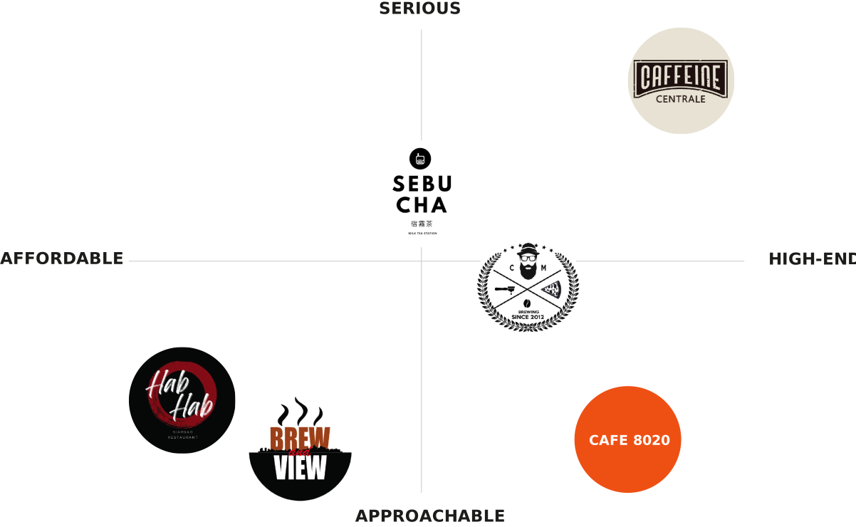
Before we touched a single shape, we mapped where Cafe 8020 sat against its competition. We looked closely at the local competitive field. Most had strong products and solid interiors, but weak spots too: limited parking, a narrow product range.
Cafe 8020’s real advantages were clear from their brand discovery form: quality coffee at a reasonable price, a relaxed ambiance, and spacious parking, serving a mostly younger, middle-class crowd of families and millennials in Liloan, Consolacion, and Compostela.
We plotted the competitive field on two axes: affordable to high-end, and approachable to serious. Most competitors clustered toward affordable and casual, or serious but cold. We positioned Cafe 8020 in the space nobody else owned: high-end, but still approachable. Serious about the craft, warm in the experience.
Creative Direction Proposals
From there, we brought Cafe 8020 four creative directions to react to:
CREATIVE DIRECTION 1
Country Picnic
Warm, earthy yellows, oranges, and browns with a sky blue accent. A nostalgic, countryside-picnic feel.
CREATIVE DIRECTION 2
Whimsical Minimalist
Light, airy, muted but still vibrant. Playful shapes and typography.
CREATIVE DIRECTION 3
Bold, Organic Shapes
Loud, bright, and energetic. Fun over formal.
CREATIVE DIRECTION 4
Vintage Modern
Warm colors, wavy shapes, a blend of modern and vintage elements. Timeless and sophisticated at once.
We laid out the pros and cons of each direction rather than pushing Cafe 8020 toward one answer. That’s deliberate. A rebrand only holds up long term if the client recognizes themselves in it, not just the direction we liked best.
Initial Logo Redesign Proposals
With the direction locked in, we brought Cafe 8020 three logo concepts to choose from.
PROPOSAL 1
Organic Shapes & Pareto Meaning
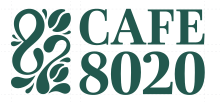
built the “8020” out of organic, vintage-inspired shapes. Two bean-like forms represented the 20 percent cause in the Pareto Principle, the fundamentals. Eight liquid-icon shapes represented the 80 percent outcome, the finished cup. It was the concept most directly tied to the brand’s actual name and philosophy.
PROPOSAL 2
Stacked Serif Mark with Ratio Cues
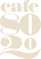
was a bold, stacked serif wordmark reading “cafe 80 20.” The zeros in “80” and “20” were reshaped into abstract coffee beans, with the zero in “80” drawn slightly larger than the zero in “20,” a quiet nod to the ratio itself.
PROPOSAL 3
Stacked Serif Mark with Ratio Cues
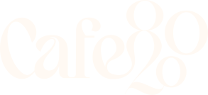
used a flowing, connected script reading “Cafe820,” with the “80” nested directly into the letterforms. The strokes echoed the waves you see in latte art, and the whole mark leaned into the vintage modern brief with a lighter touch than the other two.
We presented all three side by side rather than ranking them. Cafe 8020 chose Proposal 1, the organic bean-and-liquid icon concept, because it was the only one that visualized the actual meaning behind their name instead of just styling the numbers.
Finalizing the Logo
Choosing a concept was the beginning, not the end. Proposal 1 went through several rounds of refinement before it became the finished mark.
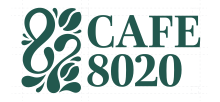
Version 1.5
Adjusted alignment and spacing, smoothed the curves in the icon.
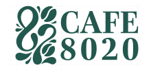
Version 1.5A
Reduced the text size so the icon became the visual focal point.
Version 1.5B
Kept the same text sizes, which made the numerals read slightly thicker.
Version 1.5C
Adjusted the letter-spacing in “8020” to match the width of “CAFE” above it.
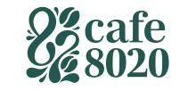
Version 1.5D
Set “cafe” in small caps to balance the width across both words.
Version 1.5E
Set “cafe” in small caps to balance the width across both words.
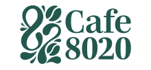
Version 1.5E
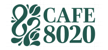
Reduced the text size once more for balance, and added an accent line over the “e,” turning “cafe” into “Café.” That accent tied the mark back into the vintage modern brief and became the version Cafe 8020 approved.
Version 1.5
Version 1.5A
Version 1.5B
Version 1.5C
Version 1.5D
Version 1.5E
Version 1.5F
Your brand should work as hard as you do.
If it’s not attracting the right clients, not looking the part, or not standing out in your market, that’s not a branding problem. That’s a business problem. We fix it.
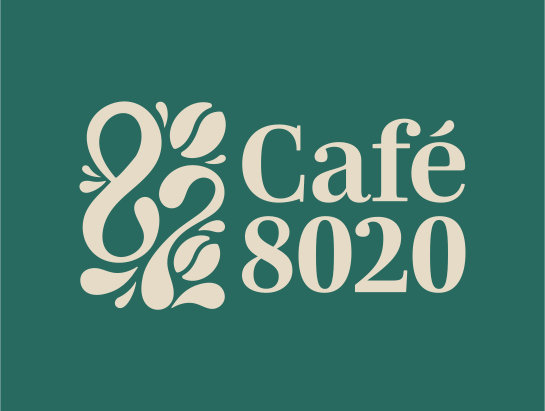
a refined organic icon paired with the “Café 8020” wordmark, set in Montserrat Bold for headers and Montserrat Light for body and sub-header use.
Brand Colors
286a60
CMYK: 84, 39, 62, 22
R: 40 G: 106 B: 96
719484
CMYK: 59, 29, 51, 4
R: 113 G: 148 B: 132
c44445
CMYK: 17, 87, 74, 5
R: 196 G: 68 B: 69
eae0cc
CMYK: 7, 9, 19, 0
R: 234 G: 224 B: 204
Old Logo
New Logo
Conclusion
Cafe 8020 came to us with a logo that got lost next to the competition and a name that meant more than the design was showing. What they have now is a mark that’s unmistakably theirs: a green, vintage-modern identity built out of the same philosophy that shapes every cup they pour.
While the category stayed black and white, Cafe 8020 went green. While everyone else chased modern, Cafe 8020 chose timeless. The result is a brand that looks as considered as the coffee it serves, and one that Cafe 8020 can carry across every cup, bag, and storefront with confidence.
Cafe & Coffee Shop Branding That Stands Out
If your cafe or coffee shop logo is starting to blend in with everyone else’s, this is the kind of work we do. Talk to us about your brand, or see what’s included in our Branding Design Packages.