





4D-SPEC Mining Technology Branding
Building a Stronger Brand Identity for a High-Performance Computing Company
How Pugo developed a strategic brand positioning, visual identity, and digital brand system for 4D-SPEC, a specialized technology partner for Australia’s mining industry
Client
Industry
Mining Technology, IT Infrastructure & High-Performance Computing
Services
Brand Strategy, Brand Positioning, Creative Direction, Logo Design, Brand Identity, Brand Guidelines, Corporate Identity, Presentation Design, Social Media Design, Website Design & Development
The Challenge
4D-SPEC provides high-performance computing infrastructure, managed IT services, and technical consulting for Australia’s mining industry. In simple terms, they help mining companies handle demanding computing and technology requirements without having to build and manage everything themselves. Their expertise was not the problem. The challenge was communicating that expertise through a brand that immediately felt credible, specialized, professional, and relevant to the mining industry. They were operating in a market where large technology providers such as AWS and Microsoft Azure have strong global recognition. These companies serve many industries, while 4D-SPEC has a much more focused advantage: they understand
Building a Mining Technology Brand That Could Compete on Expertise
The key challenges were:
- Position the company as a serious technology partner for mining.
- Communicate expertise without relying on technical jargon.
- Feel premium and professional without becoming distant or inaccessible.
- Differentiate the company from generic IT and technology providers.
- Build confidence with both business decision‑makers and technical teams.
- Create a consistent foundation for future marketing, sales, and digital materials.
The central branding question became: How do we make specialization feel like a competitive advantage?
Brand Keywords
Engineering
Reliable
Information Technology
Mining
Tailored Solutions
Specialized
Results-Driven
Scalable
Secure
Phase 1
Brand Discovery and Research
Before developing the visual identity, we first needed to understand the business behind it.
Pugo’s branding process begins with discovery because effective branding should be based on the business, its customers, its market, and its goals, not simply on visual preferences.
We explored 4D-SPEC's:
- Business and services
- Target customers
- Industry
- Competitors
- Market position
- Business goals
- Desired customer perception
From the discovery work, several brand attributes emerged: Specialized. Reliable. Customer-Centric. High-Performance. Results-Driven. Cost-Effective. Hassle-Free. Mining-Focused. These attributes became the criteria we used to evaluate the strategic and creative decisions that followed.
Phase 2
Brand Positioning Strategy
Positioning 4D-SPEC as a Specialized Mining Technology Partner
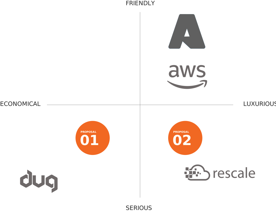
Once the research was complete, we translated the findings into a clear brand positioning. We mapped the competitive landscape using two dimensions:
Economical ↔ Premium
Friendly ↔ Serious
This helped us understand how established providers and other competitors were perceived and where 4D-SPEC could establish a more distinctive position.

Large global technology providers can offer sophisticated infrastructure and strong brand recognition, but their broad market focus does not necessarily communicate deep specialization in mining. That created an opportunity for 4D-SPEC.
The Selected Brand Position
The objective was not to make 4D-SPEC look like a smaller version of a global cloud provider. It was to make the company look like a technology partner that understands the specific environment, requirements, and pressures of mining. This became the strategic filter for the rest of the project.
The logo, visual identity, photography, messaging, website, and supporting materials all needed to reinforce this same position.
Phase 3
From Strategy to Creative Direction
Turning the Brand Strategy Into a Visual Direction
With the brand positioning established, the next question was:
What should this strategy look and feel like?
Rather than immediately designing a logo, we explored several creative directions based on the strategic foundation.
This stage connected the business strategy to the visual identity and gave us a clearer basis for evaluating design concepts. Pugo’s documented branding process similarly places creative direction after strategy and before initial logo proposals.
Creative Direction 1
Cutting-Edge Technology
The first direction focused on innovation and technical sophistication. It explored minimalist layouts, geometric forms, and restrained typography to communicate precision and advanced technology.
The direction successfully communicated technical capability, but it risked making 4D-SPEC look like a generic technology company rather than a company specifically serving mining.

Creative Direction 2
Industrial Solutions
The second direction drew more heavily from the mining and industrial environment. Bold forms and rugged visual characteristics communicated durability and hands-on expertise.
This created a stronger connection to the industry, but it did not provide enough of the premium and sophisticated perception required for the brand’s desired market position.

Creative Direction 3
Global Authority
The third direction took a more established corporate approach. It emphasized professionalism, trust, and credibility, qualities that would help the company compete with larger technology providers.
However, the direction felt too traditional and did not communicate enough of 4D-SPEC’s specialized mining focus.

The Selected Creative Direction
Combining Technology, Mining Expertise, and Professionalism
The final creative direction brought together the strongest qualities from the concepts we explored.
It combined:
- The precision of a modern technology company
- The authenticity of the mining industry
- The professionalism expected from an enterprise technology partner
This was an important decision. We did not want to make 4D-SPEC look like another software or IT company.
We wanted the identity to communicate: Advanced technology, backed by genuine mining expertise. That direction became the foundation for the logo, brand identity, photography, graphic elements, messaging, and website.
Phase 4
The Plan
Turning the Brand Strategy Into a Consistent Brand System
Once the positioning and creative direction were approved, we had a clear strategic foundation to move into execution.
The strategy was not treated as a document that would sit separately from the design work.
Instead, we used the selected positioning and creative direction as a decision-making framework for everything that followed.
The Execution Moved Through Four Connected Stages
The goal was to establish the brand system first, then apply that system consistently across the company’s materials and digital presence.
Logo Design
Branding Guide
Brand Touchpoint Kits
Website Design & Development
Pugo's broader process follows the same principle: discovery informs strategy, strategy informs design direction, and the approved strategy guides the branding, website, and marketing applications.
Phase 5
Logo Design
Exploring the 4D-SPEC Logo Before Reaching the Final Design
The logo was not designed in isolation. It was developed after the brand positioning and creative direction had been established. We first explored multiple initial logo concepts based on the selected direction.
Proposal 1
Typography-Focused Wordmark
Digital Industrial Style
A custom font design for the wordmark logo, aligning with the Industrial Solutions creative direction. The font retains the essence of the current logo but is stylized to convey a more serious and cutting-edge appearance, reminiscent of digital fonts seen on electronic displays. The color palette features a darker shade of the current blue, enhancing its seriousness and strength.
Proposal 2
Stable & Bold Geometric
Cross-Media Consistency
This proposal introduces bolder shapes with wider bases, imparting a strong, stable, and dependable look suitable for industrial brands with a touch of cutting-edge technology. The design is clean, clear, and bold, complemented by a blue color scheme closely matching the current shade, adjusted for both print and web applications. Unlike the current RGB-only color, this version ensures consistency across digital and print mediums.
Proposal 3
Balanced Hybrid
Strength with Approachability
Combining elements from Proposals 1 and 2, this design strikes a balance. It retains the essence of the original font while adding boldness akin to Proposal 2 and incorporating the edginess of Proposal 1. This approach achieves a serious and cutting-edge aesthetic, yet the subtle curves add a touch of approachability and friendliness. The lighter blue hue softens the overall design, maintaining a modern and welcoming feel.
Your brand should work as hard as you do.
If it’s not attracting the right clients, not looking the part, or not standing out in your market, that’s not a branding problem. That’s a business problem. We fix it.
The Final Logo
The final mark uses engineered angular forms to communicate structure, precision, and performance while maintaining a clean and adaptable appearance.
Design Variations
The guide establishes the correct logo variations, sizing, clear space, and usage rules so the identity remains consistent across applications.
Primary Logo
Secondary Logo
#2f58a7
blocks, and other elements. Used for headlines, main color
#ffffff
Used for headlines, main color blocks, and other elements.
#e6f4ff
Used for background and supporting elements
#116acc
Complimentary to main color.
Used for call to action buttons and offer backgrounds.
#383838
Used for background and supporting elements
#929497
Used for background and supporting elements
Iconography
Bold and highly legible, ensuring quick recognition and strong visual impact. Cleaner and bolder, these elements stand out effectively compared to tech-inspired ones.
Social Media
Your Services Deserve a Brand that matches them
We build brands grounded in strategy, not just aesthetics, so your identity works in the market, not just on a mood board. If your business delivers quality work but your brand doesn’t show it, that gap is costing you.
Related Projects

Ripple Media – Logo Redesign
Ripple Media Logo Redesign: A New Mark for an AI-Powered Marketing & SEO Agency From a Pastel Wave to a

Qure It Pest Control Brand – Branding and Graphic Design
Qure It Pest Control Rebrand From Brand Refresh to Stronger Market Positioning QuRE IT is a pest management company offering

Job Platform Logo Design Case Study – Newbie App Branding
Newbie App Logo Design Newbie App is a job search platform created for people who want to work but don’t
